Task
Design a calming, user-friendly website for a new wellness studio that informs visitors, builds trust, and enables seamless online bookings for natural facial treatments.
-
Role
UX Designer, UI Designer, Brand Designer
-
Timeline
2 months
-
Tools
Figma, Miro, Abobe Illustrator

Case Study
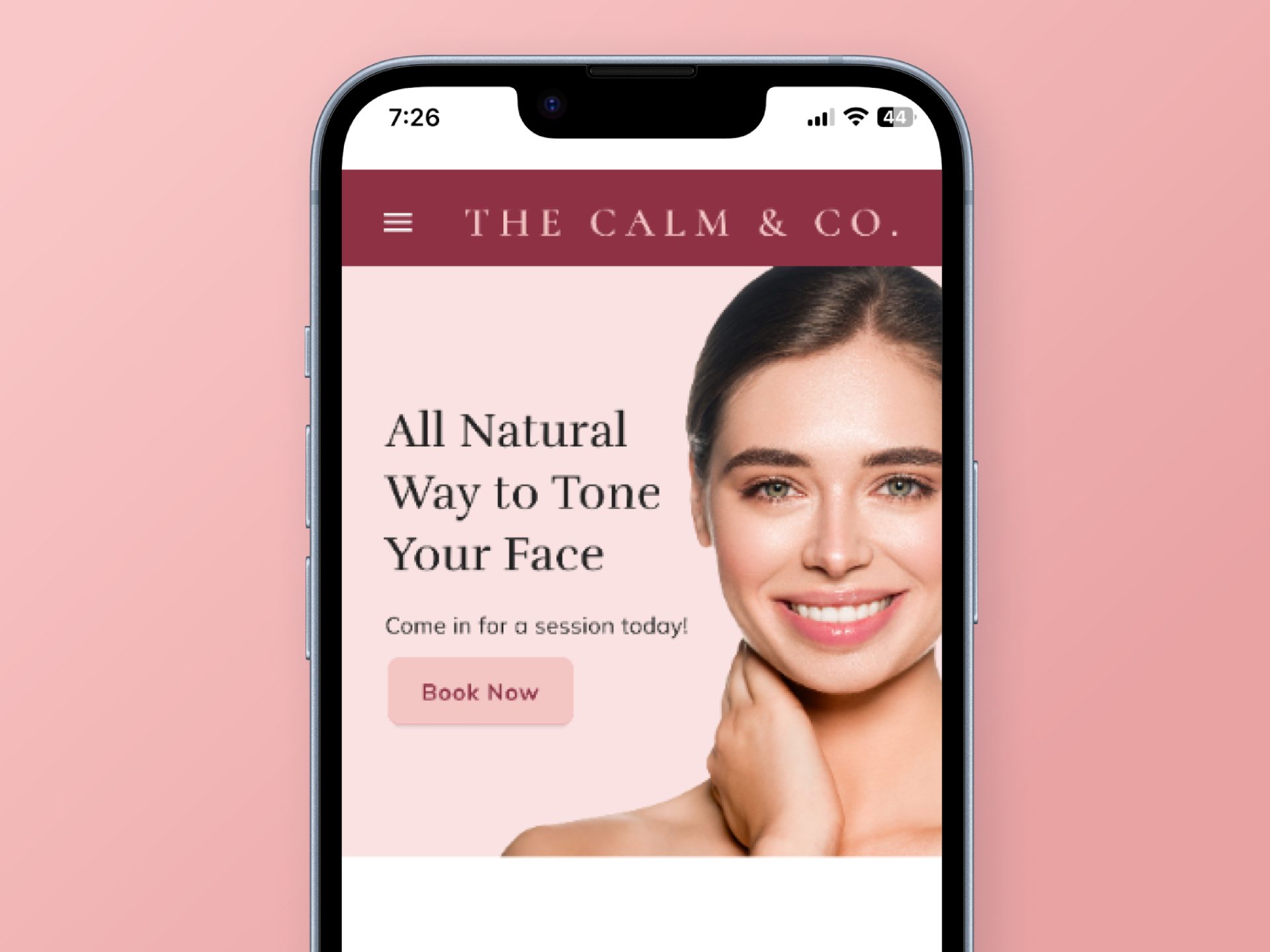
Calm & Co, a newly launched wellness studio, needed a website that welcomed new visitors, built trust, and simplified bookings. Their team faced high overhead answering the same client queries and managing multiple therapist calendars manually, leading to scheduling conflicts and inefficiencies.
I designed an inviting and informative website that not only showcases their services but also provides a seamless booking experience, reducing staff workload and enhancing customer satisfaction.
Problem
As a new wellness studio in Mumbai, Calm & Co struggled with manual client communication and appointment scheduling, leading to high overhead and frequent booking issues. They needed a seamless, centralized system to improve efficiency and client experience.
Goal
To design a warm, informative website that builds trust, simplifies bookings, reduces staff workload, and reflects Calm & Co’s self-care-focused brand.
Target Audience
Women in Mumbai, aged 30–60, seeking natural, non-invasive facial treatments and a trusted, holistic self-care experience with easy online booking.
Success Metrics
We achieved…
75%
60%
Contents

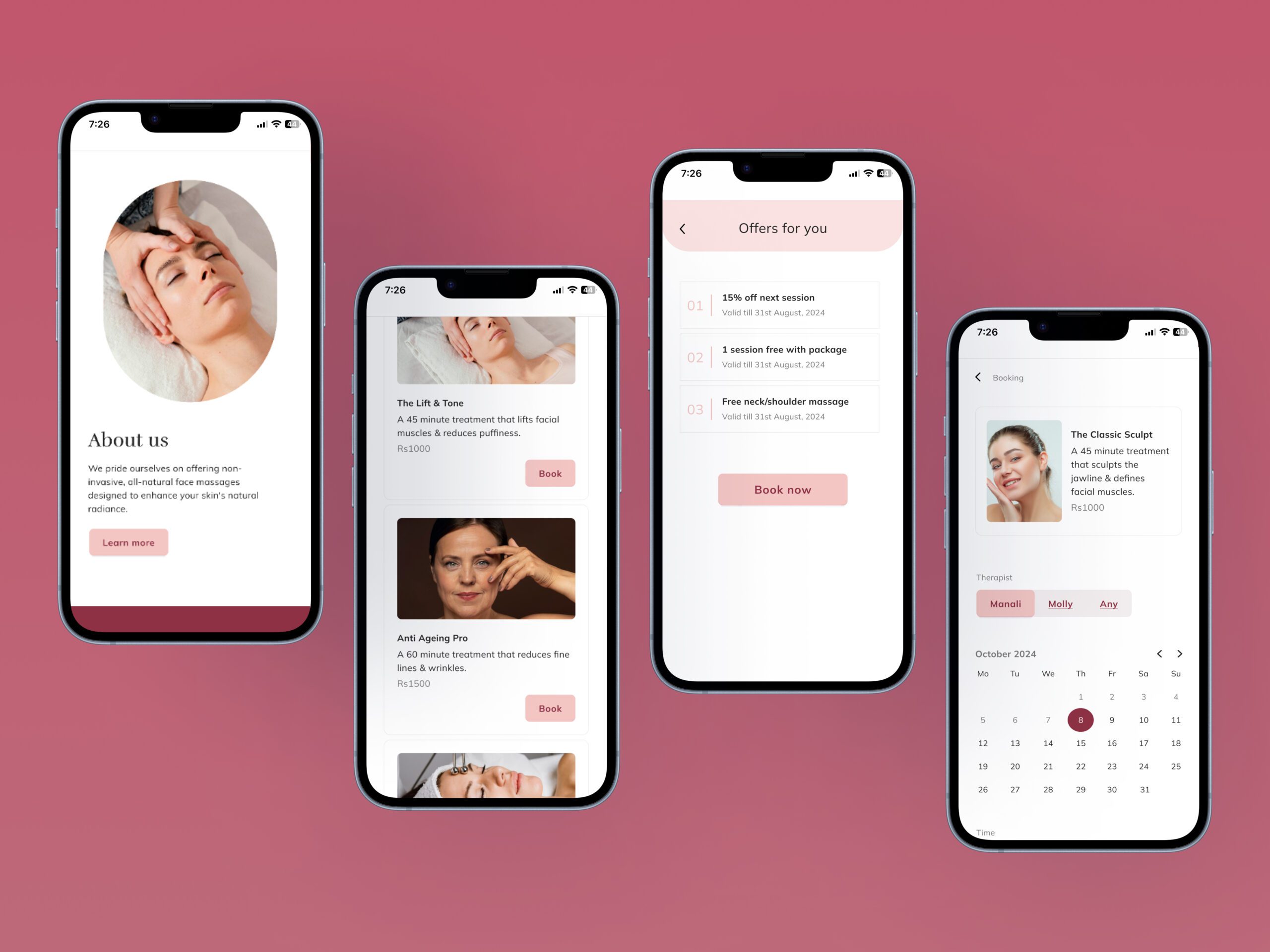
Seamless Online Booking
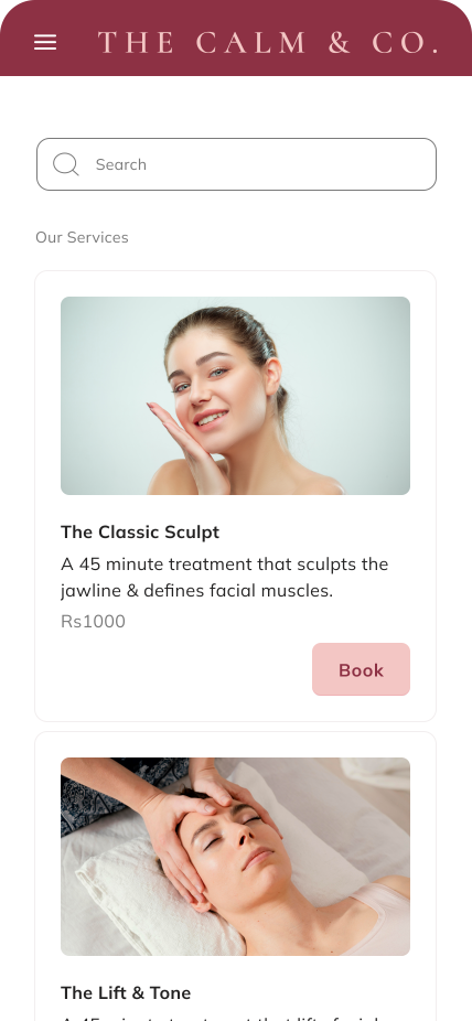
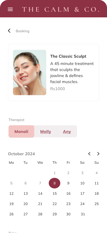
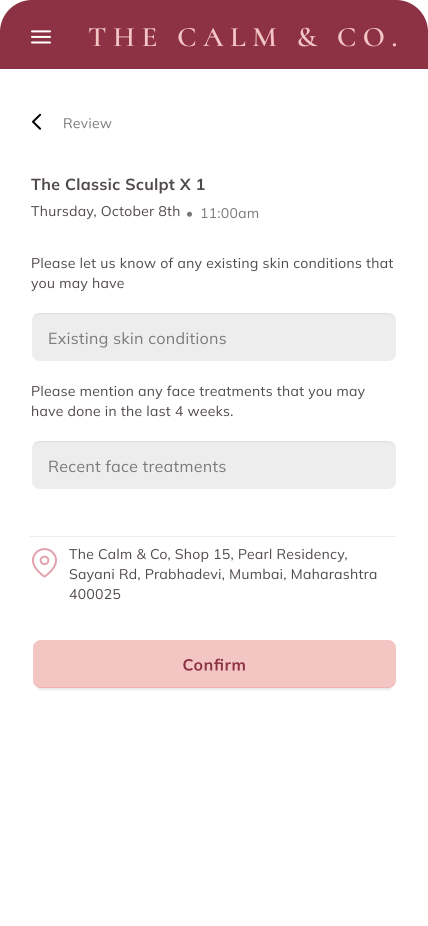
Users can browse services, select a therapist, and book appointments effortlessly. The real-time calendar ensures availability, reducing scheduling conflicts.
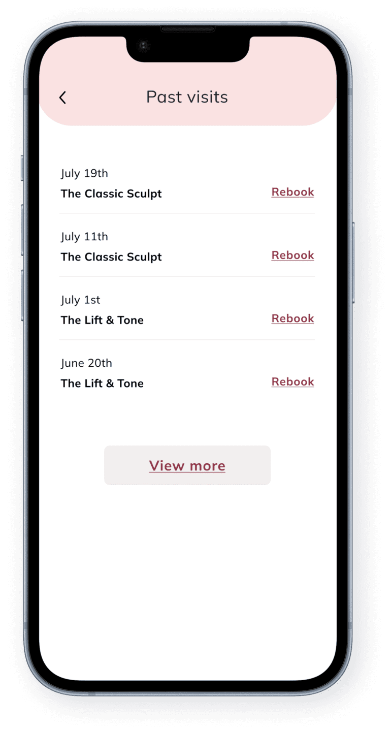
Personalized User Accounts
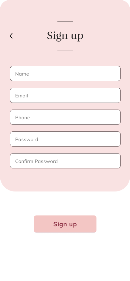
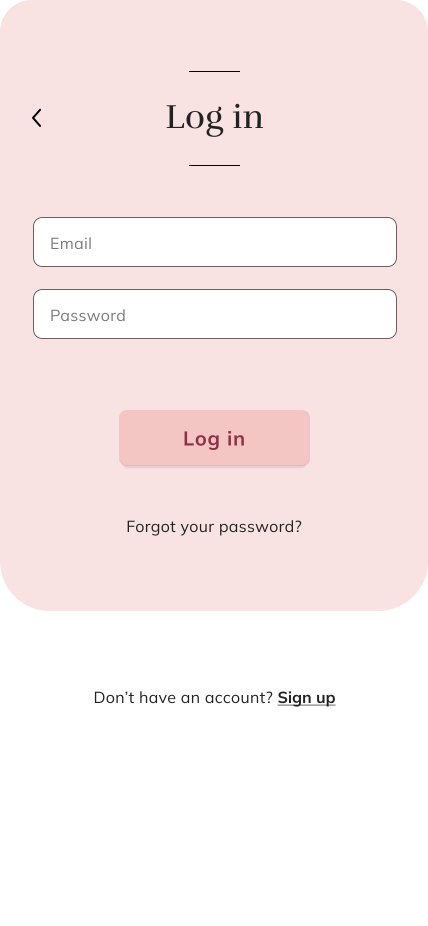
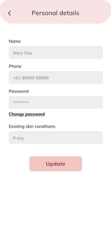
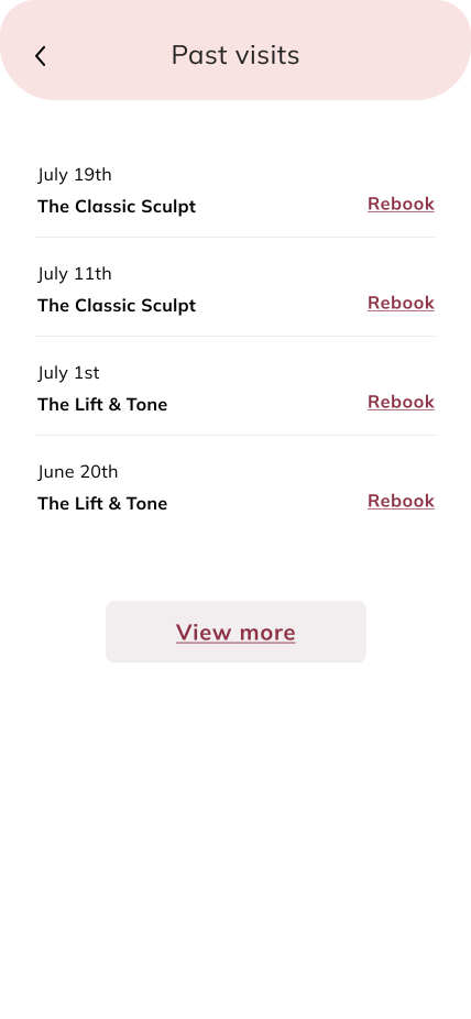
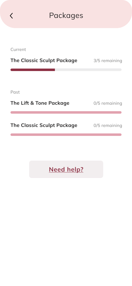
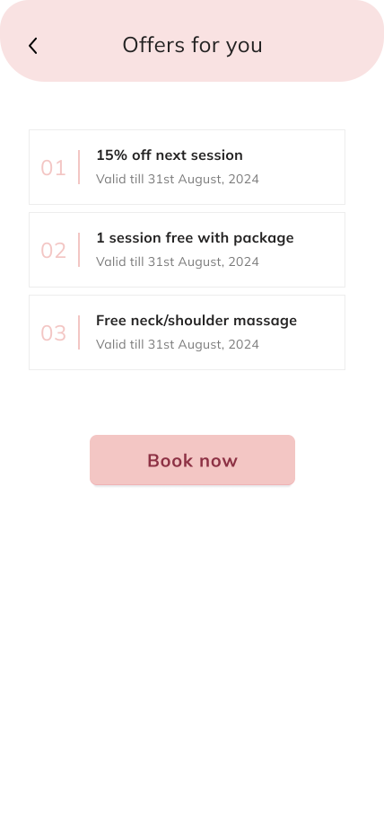
Clients can track past visits, manage appointments, and save details for faster bookings. Tailored promotions and packages enhance retention.

Informative & Trust-Building
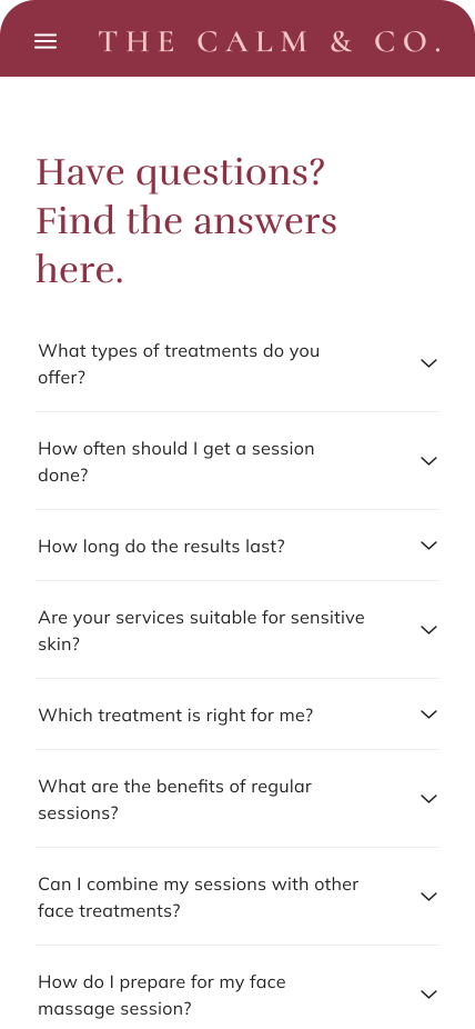
Clear service descriptions, FAQs, and pre-visit details help new users feel confident, building trust and encouraging bookings.
Research Approach
My research combined competitive analysis and user research, providing valuable insights to guide the website’s design. I explored user pain points with booking systems, identifying friction areas and expectations for a seamless experience. Additionally, I studied user psychology and behaviors related to self-care and facial spas, ensuring the website fosters trust, relaxation, and ease of use while aligning with industry best practices.
Research Goals
To understand how users discover and choose wellness services online, build trust with new brands, and engage before and after treatment. Compare competitors to identify best practices, loyalty strategies, and areas for improvement.
Research Findings
80%
of the participants hesitate to book a service online if they don’t see customer reviews or testimonials.
65%
of the participants expressed uncertainty about the brand’s credibility.
85%
of the participants showed a strong preference for loyalty programs when booking services at their regular wellness centers.
75%
of the participants prefer a quick and guided booking flow rather than complex forms.
50%
of the participants expect a “Book Again” feature for repeat bookings to save time.
Shaping the design system
I explored the psychology behind why users seek non-invasive facial treatments, uncovering themes like stress relief, confidence, appearance, and holistic wellness. These insights shaped the design system and brand language to feel calming, reassuring, and aligned with users’ self-care motivations.
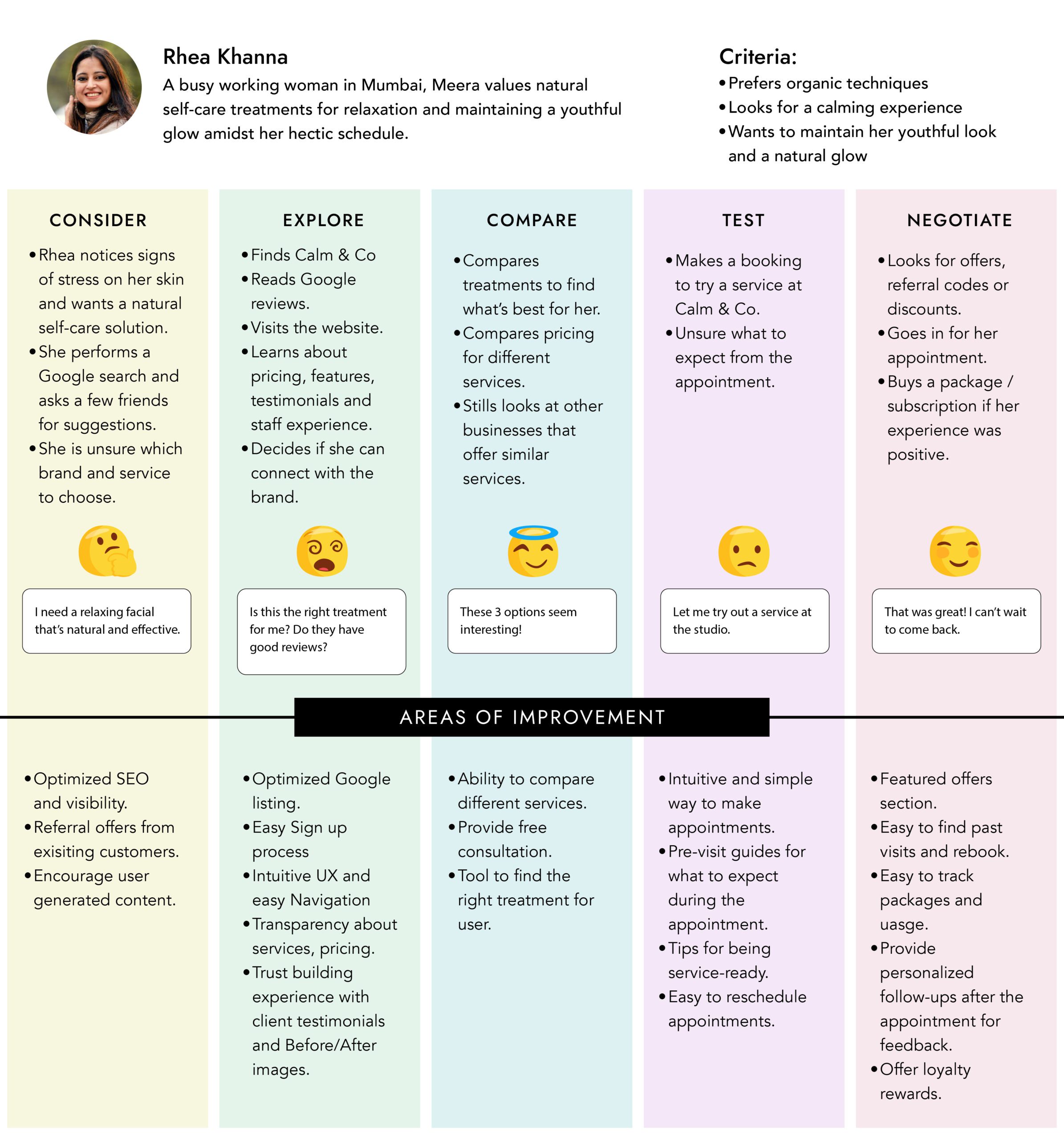
User Journey Map
I created a user journey map to understand user pain points and areas of improvement.

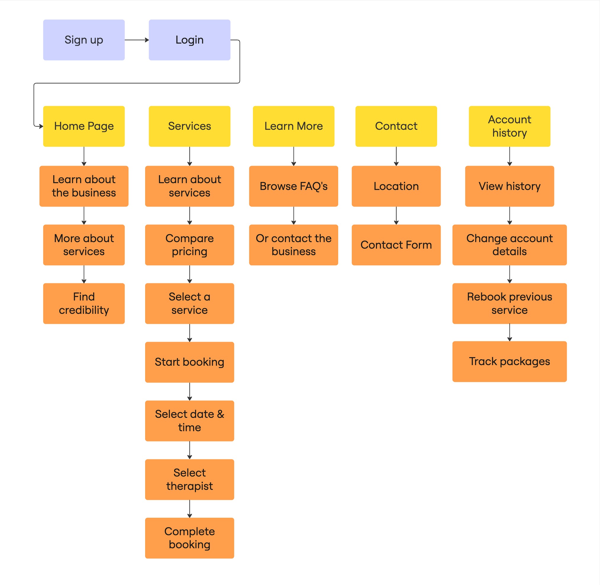
User Flow
I created this user flow to map out the key touchpoints and decision paths users take when exploring the website and booking a service. It helped ensure the experience is intuitive, goal-driven, and aligned with both user needs and business priorities.
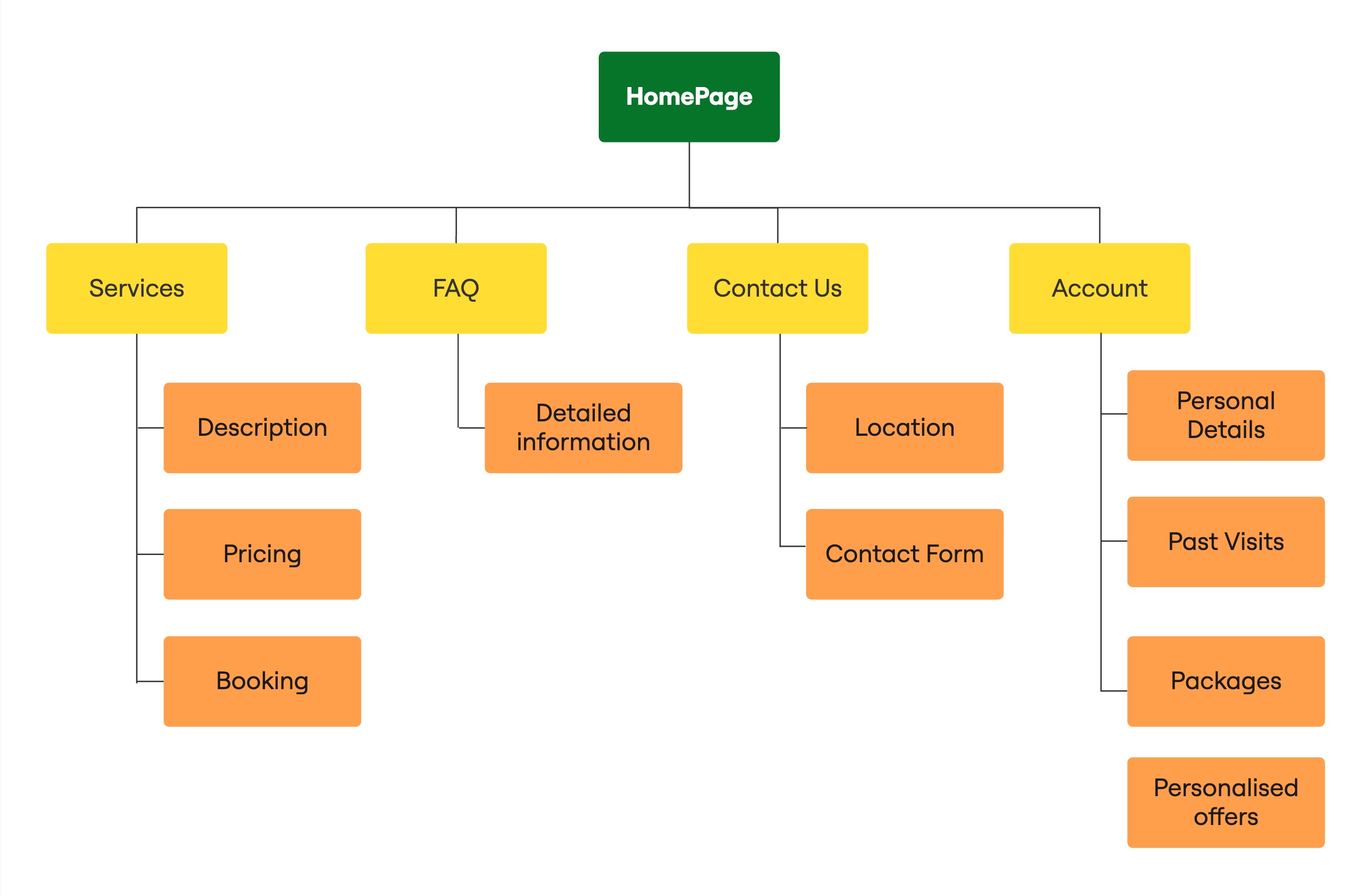
Site Map
I created this site map to organize the website’s content structure and ensure easy navigation for users. It helped define a clear hierarchy that supports both discovery and task completion, like booking or managing appointments.
Design System
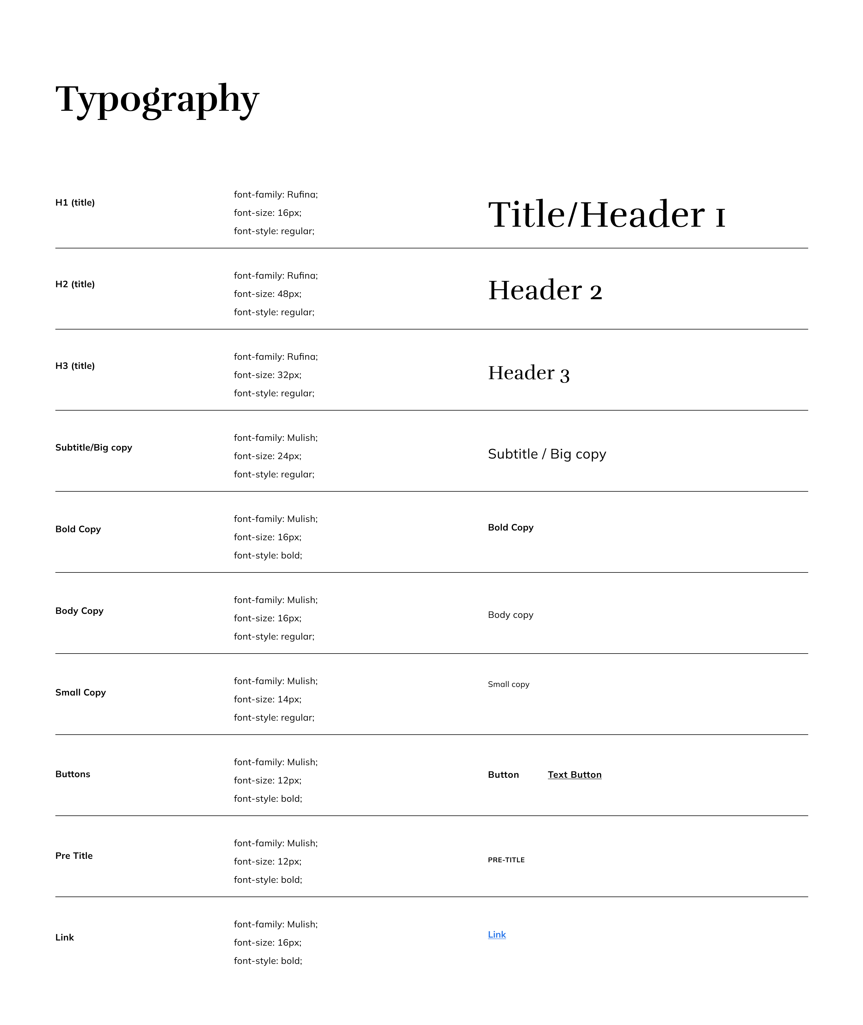
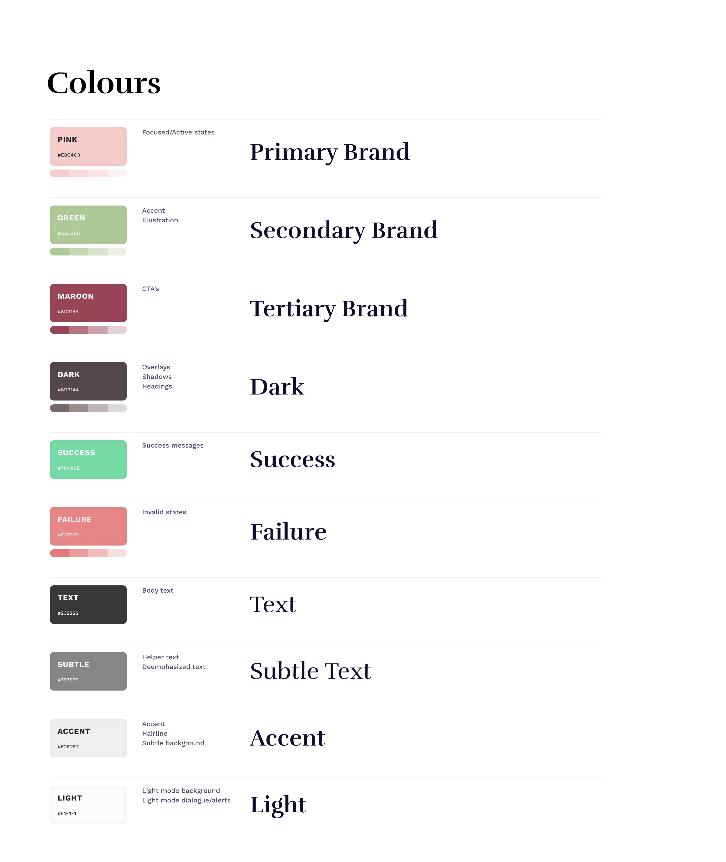
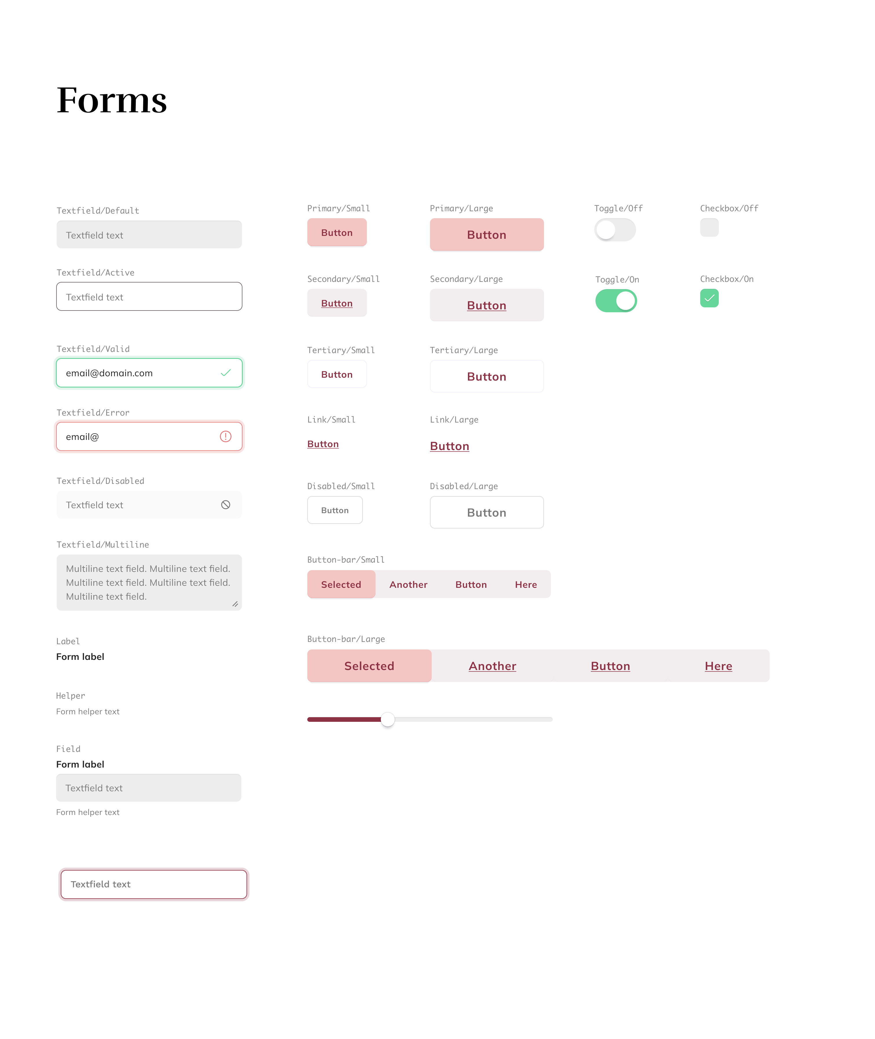
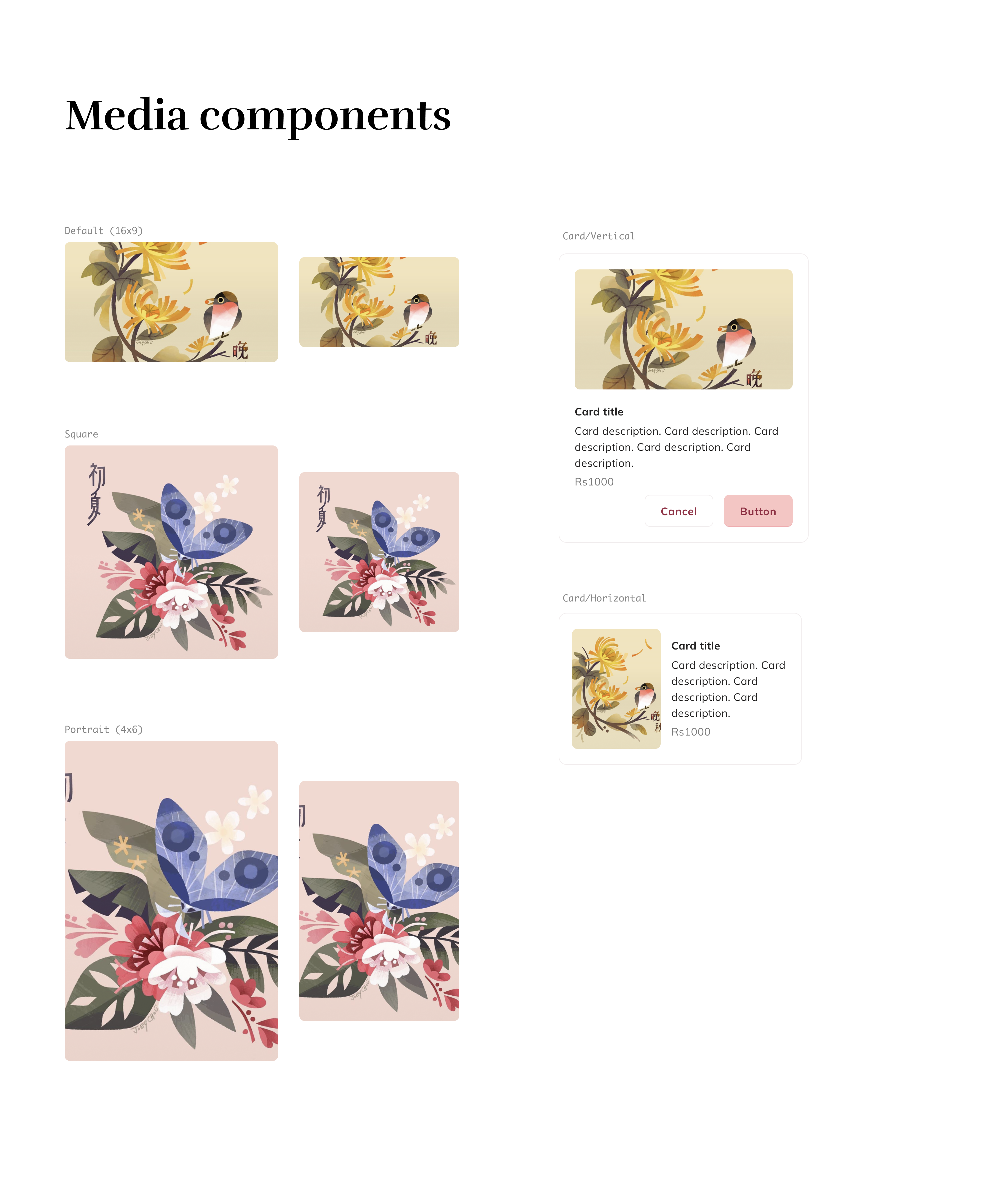
As this is a start up, I created an atomic design system. I took the brand colours and typography as a starting point, and built the design system as follows:
Typography
Colours
Buttons
Icons
Cards
Layout
Iterations
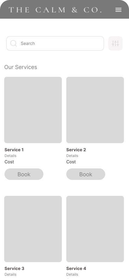
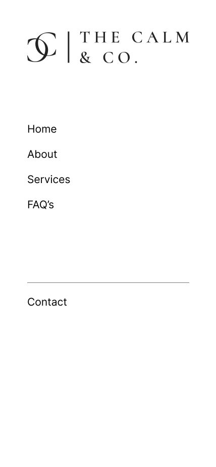
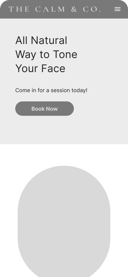
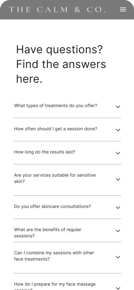
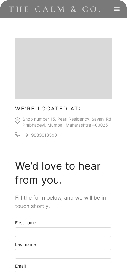
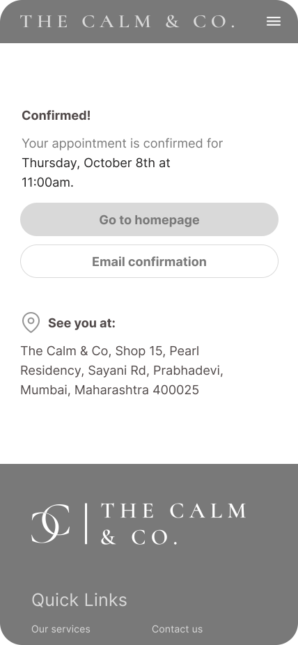
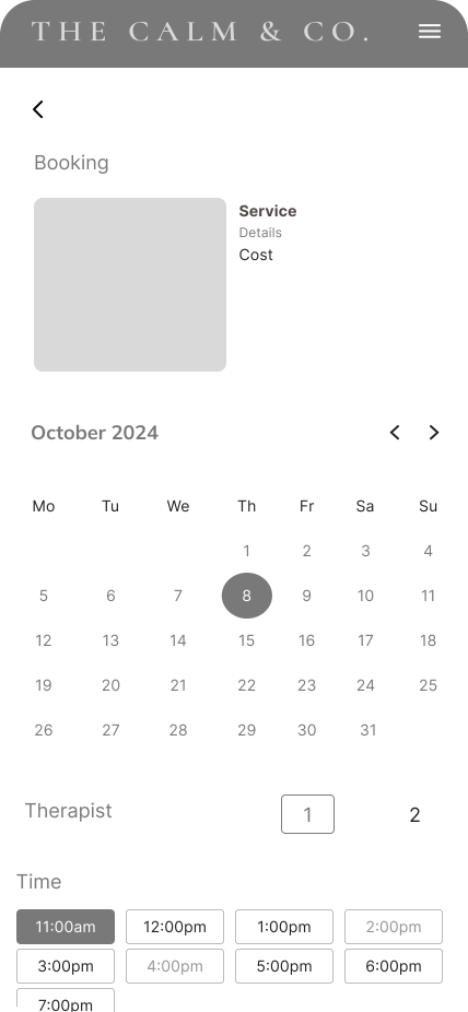
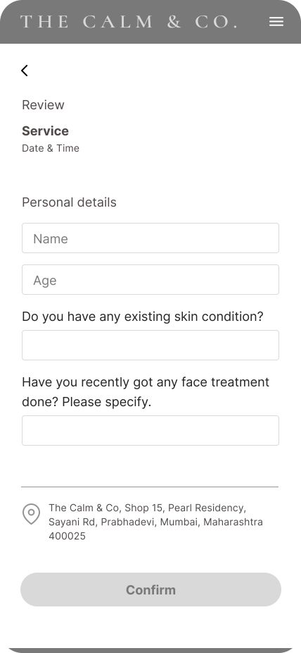
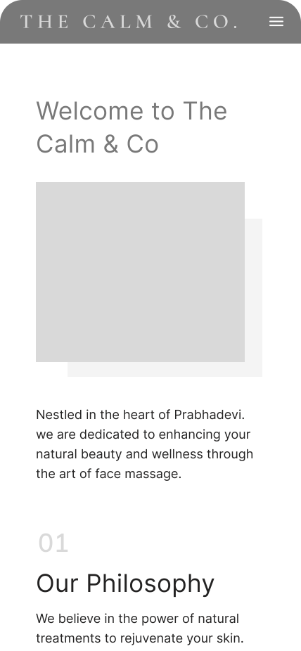
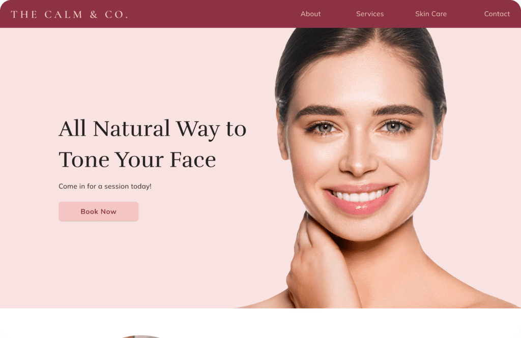
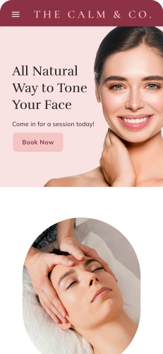
Earlier I had started with a desktop version of the wireframes, but soon I realised that mobile-first would be a better approach for this project.
From
To
75%
60%
What I Learned
This project taught me how to design a calming, user-friendly experience by aligning user psychology with business goals. I learned to simplify booking flows based on real pain points and use research and visual design to build trust, clarity, and credibility for a wellness-focused brand.
Future Scope
The next phase of the project could include launching the live website and conducting real-world usability testing to validate design decisions. There’s also potential to expand features like automated reminders, payment integration & referral incentives. Over time, adding client feedback loops and analytics tracking can help refine the user journey and support business growth.
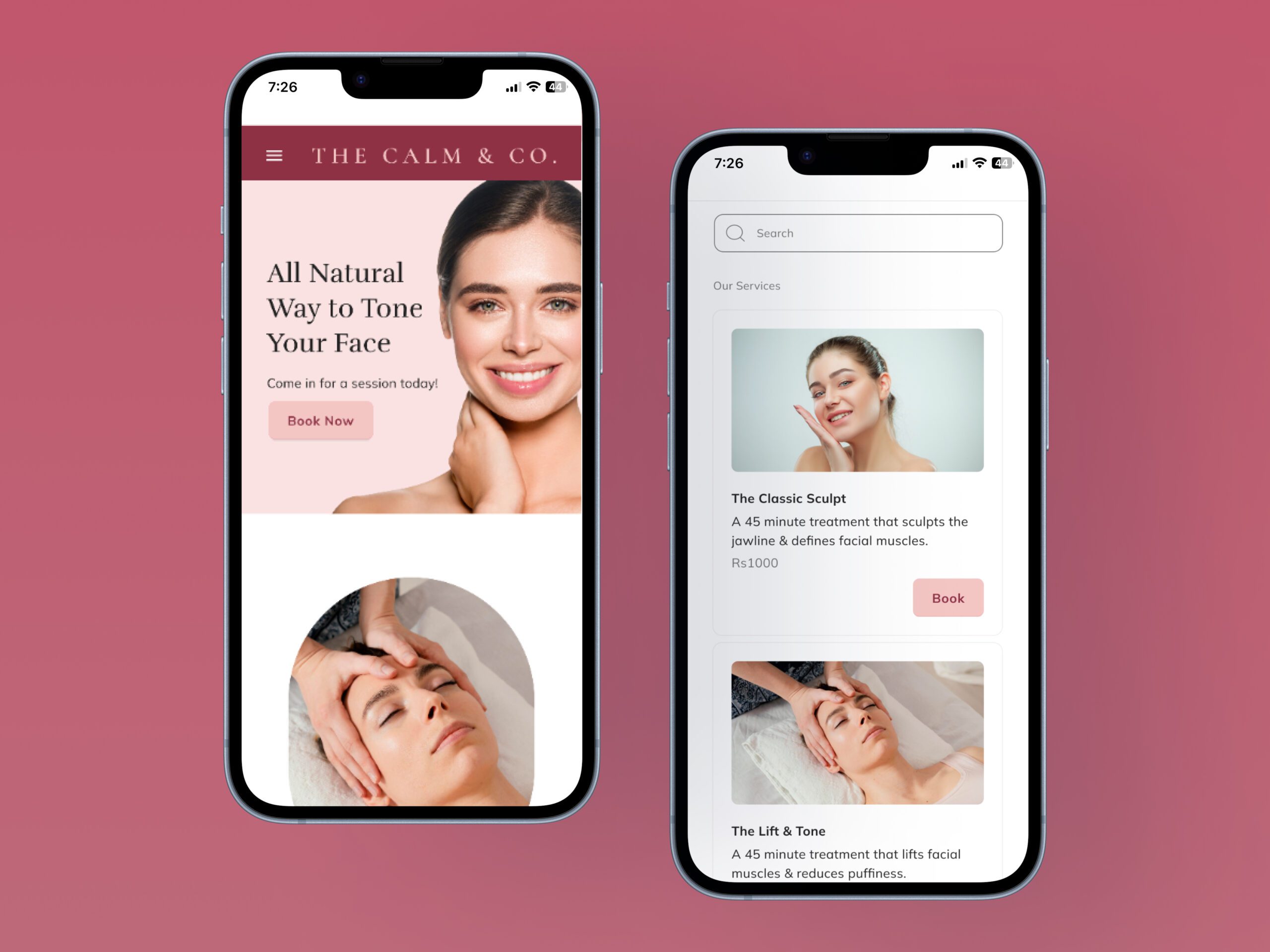
High fidelity screens
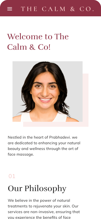
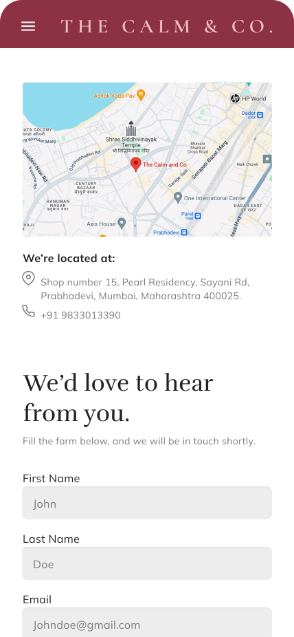
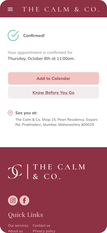
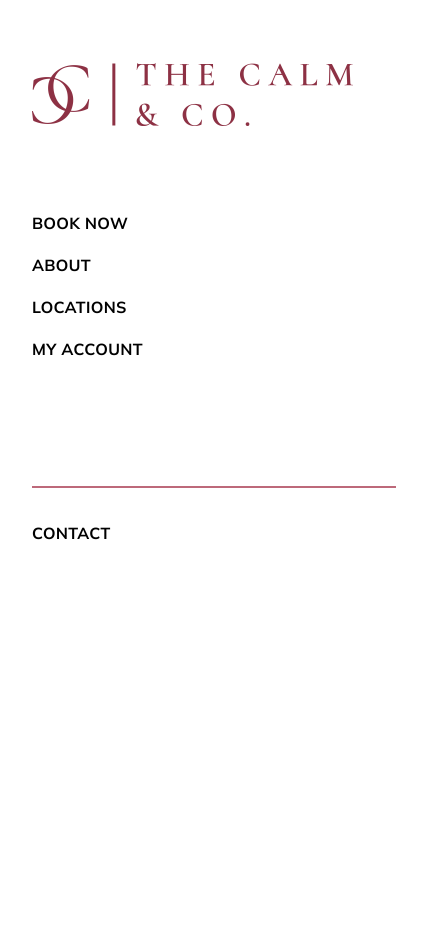
I translated the wireframes into high-fidelity screens to bring the brand to life through visuals, tone, and interaction. This stage allowed me to refine the user experience, apply the visual identity, and ensure the final design felt polished, intuitive, and aligned with Calm & Co’s calming and trustworthy personality.
