Task
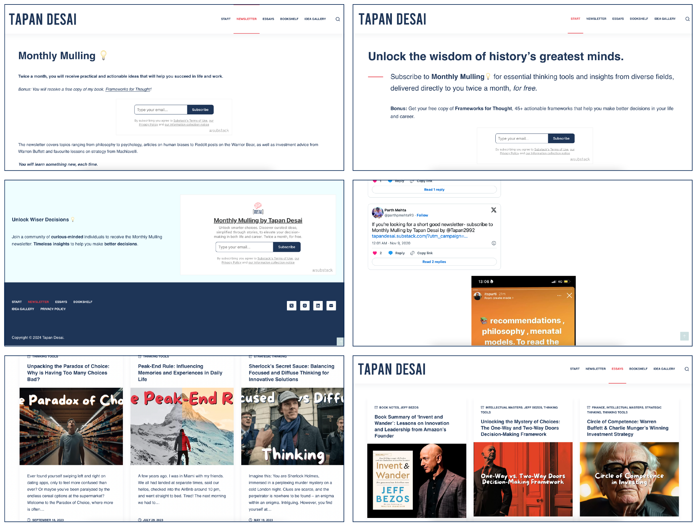
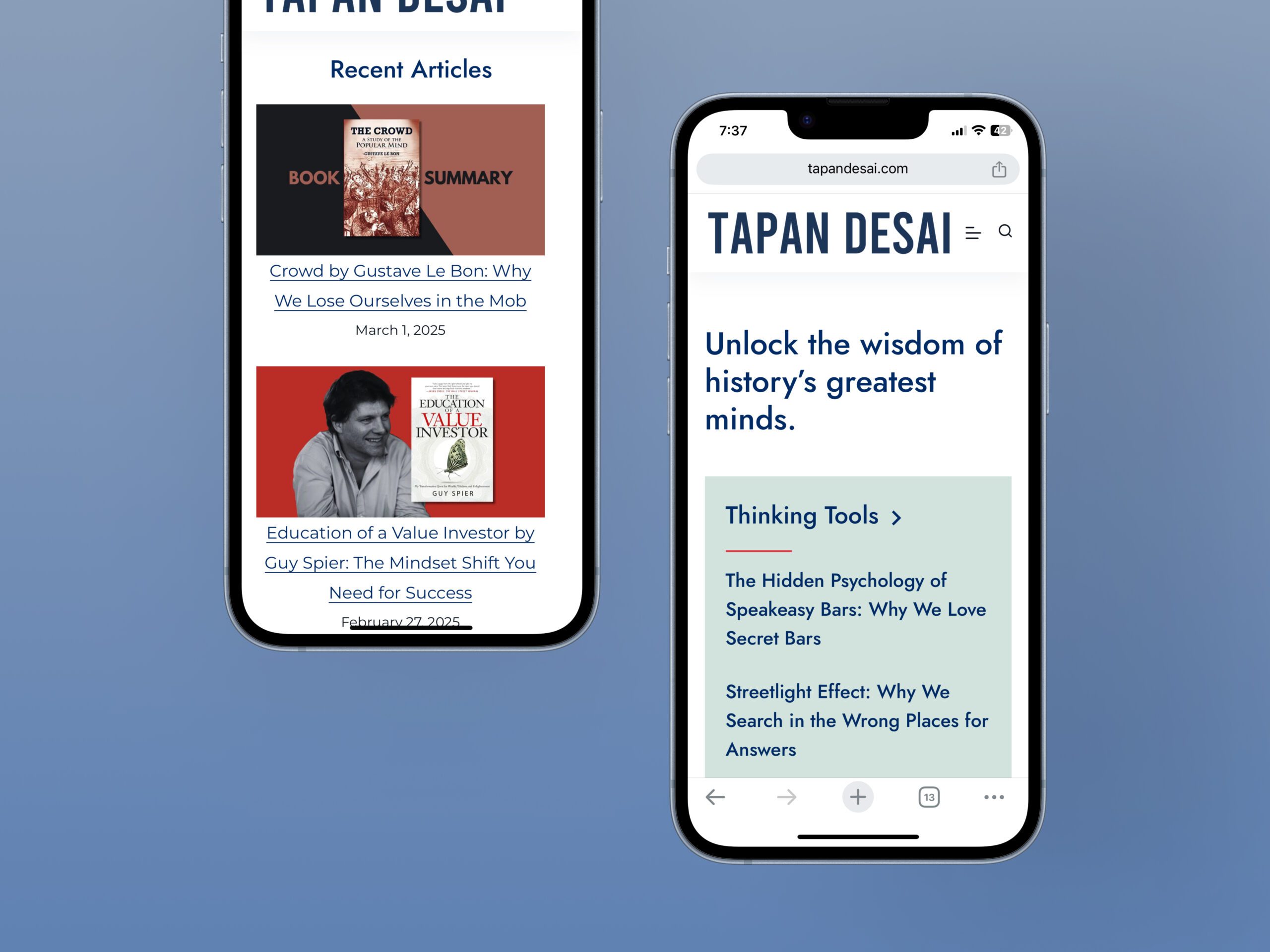
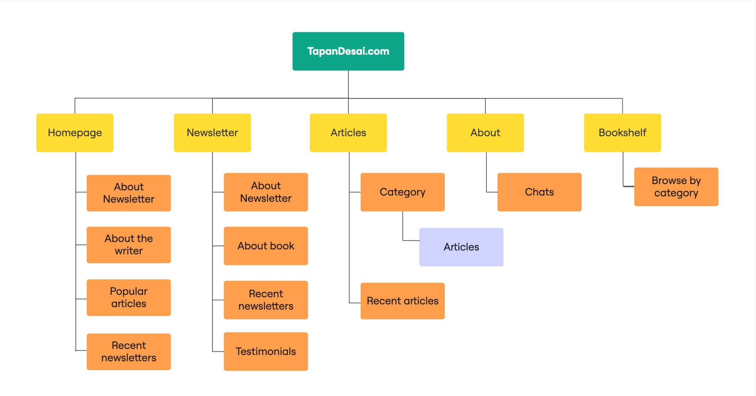
Led UX/UI research and analysis to identify usability pain points and gaps through user interviews, surveys, and heuristic evaluation.
-
Role
UX Designer, UI Designer, UX Researcher
-
Timeline
2 months
-
Tools
Figma, Miro, Abobe Illustrator, WordPress
Case Study
Tapandesai.com is a blogging platform that explores topics in history, philosophy, and decision-making frameworks. They also publish Monthly Mulling, a bi-weekly newsletter that delves into cognitive biases, decision-making strategies, and real-life examples.
They reached out to me for a website redesign due to challenges in converting visitors into subscribers, a suboptimal reading experience, and low click-through rates from Google search results. Despite ranking well on Google, the site struggled to attract visitors and effectively convert them into engaged subscribers.
Problem
Despite strong SEO, Tapandesai.com struggled to convert visitors into subscribers. A poor reading experience, low engagement, and unclear CTAs limited both retention and reach.
Goal
Redesign the site to boost engagement and conversions by improving readability, simplifying navigation, and enhancing subscription visibility, while optimizing for SEO-driven traffic.
Target Audience
Intellectually curious professionals, history/philosophy enthusiasts, and lifelong learners who seek thoughtful, distraction-free content experiences.
Success Metrics
20%
47%
85%
Contents
- Features
- Research Approach
5.1 Research Goals
5.2 Research Findings
5.3 Affinity Diagram
5.4 UX Audit - Site Map
- Typography
- Design Approach
- Wireframes
- Impact
- What I learned
- Future Scope
- High Fidelity Screens
Establishing credibility
Clear communication of benefits
Easy navigation through book categories
Research Approach
To identify key usability issues and opportunities for improvement, I conducted a comprehensive UX audit, combining multiple research methods:
- User Testing – Observed real users interacting with the website to uncover pain points and areas of friction.
- Heuristic Evaluation – Assessed the site using usability principles to identify design inconsistencies and usability flaws.
- Secondary Research – Analyzed industry best practices, competitor strategies, and user discussions to understand broader trends and opportunities.
These methods provided a clear understanding of user behaviour, allowing me to make data-driven design decisions for an improved experience.
Research goals
Through a UX audit and heuristic evaluation, assess navigation, readability, and barriers that may cause user frustration or early drop-offs.
Through user testing, observe how visitors interact with subscription prompts and identify friction points preventing them from signing up.
Analyze how users read and engage with long-form content. Identify whether formatting, layout, or structure is affecting comprehension and retention.
Using heuristic evaluation and user testing, determine if users can easily find and explore articles, and identify any confusion in the site’s structure.
Through secondary research, compare the website’s design, content strategy, and subscription flow with high-performing competitor websites and industry standards to uncover improvement opportunities.
Research Findings
65%
of the participants were unsure about the authenticity of the writer/business.
70%
of the participants missed the communication of subscription benefits.
80%
of the participants found site navigation confusing.
70%
of the participants found ads to be distracting as they consumed written content.
50%
of the participants had trouble with content readability.
Affinity Diagram
Based on research, I found common themes that gave me insights for the design process.
UX Audit
Below are screenshots from the previous website design.
Alongside the research findings, the UX audit identified the following areas for improvement -
Long line lengths and dense layouts made reading difficult, especially for long-form content, violating the heuristic of aesthetic and minimalist design.
Repetitive or unclear navigation headers confused users, increasing cognitive load and violating recognition over recall.
Subscription CTAs lacked clarity and prominence, reducing conversions, making it hard for users to understand the value or next step.
Mismatched font styles and sizes disrupted visual hierarchy, making the interface feel unpolished - affecting consistency and standards.
Poor contrast hindered readability and accessibility, particularly for users with visual impairments—violating accessibility and error prevention heuristics.
Site Map
Typography
Design Approach
I adopted a desktop-first approach while ensuring a seamless experience on mobile. Since the website is text-heavy, I primarily used a single-column layout for better readability. Grids were strategically incorporated only when displaying multiple articles, making it easy to scale across different screen sizes. This approach allowed for a cohesive design that balanced readability on desktop and usability on mobile.
Wireframes


20%
47%
85%
What I Learned
Even though I am a subscriber to this newsletter, I had to consciously remember throughout the project that I am not the user for this case study. I couldn’t let me biases influence the project, and made sure design decisions were based on research.
The client was using Gutenberg for development, so I had to work within the constraints of the editor and did not have the same flexibility as some other projects. During the process I found methods to best fit the constraints of Gutenberg while ensuring a seamless user experience.
There were also restrictions we encountered due to Substack limitations, which we incorporated into the design. You can find the redesigned version here – https://tapandesai.com/
Future Scope
I think the business would benefit from a consistent style in blog covers that would have good recall value when shown on Google images.
From accessibility standpoint, the newsletter and articles could have an audio reader so users can listen to the content. Variable font size while consuming content could improve accessibility.
High Fidelity Screens


