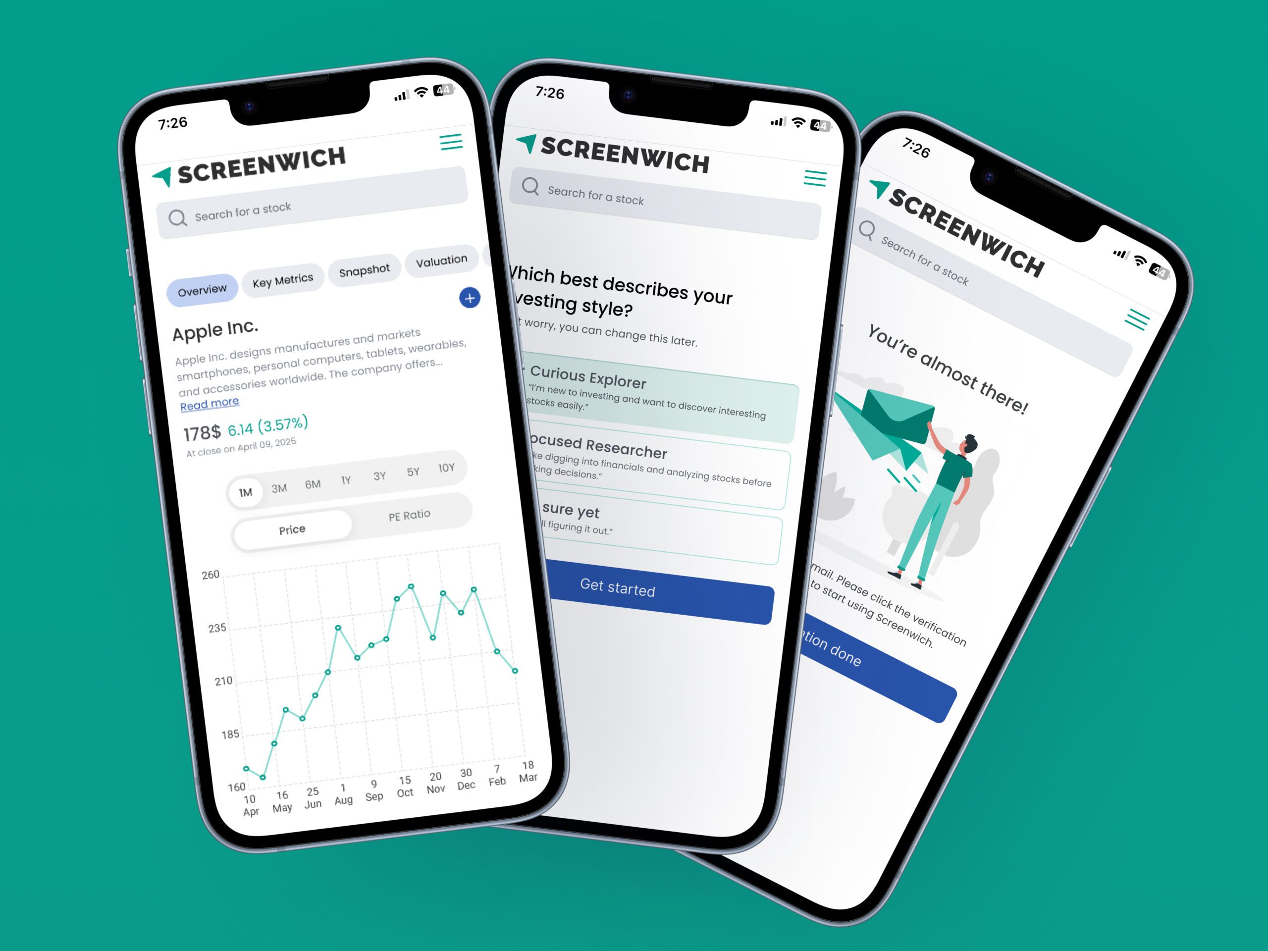
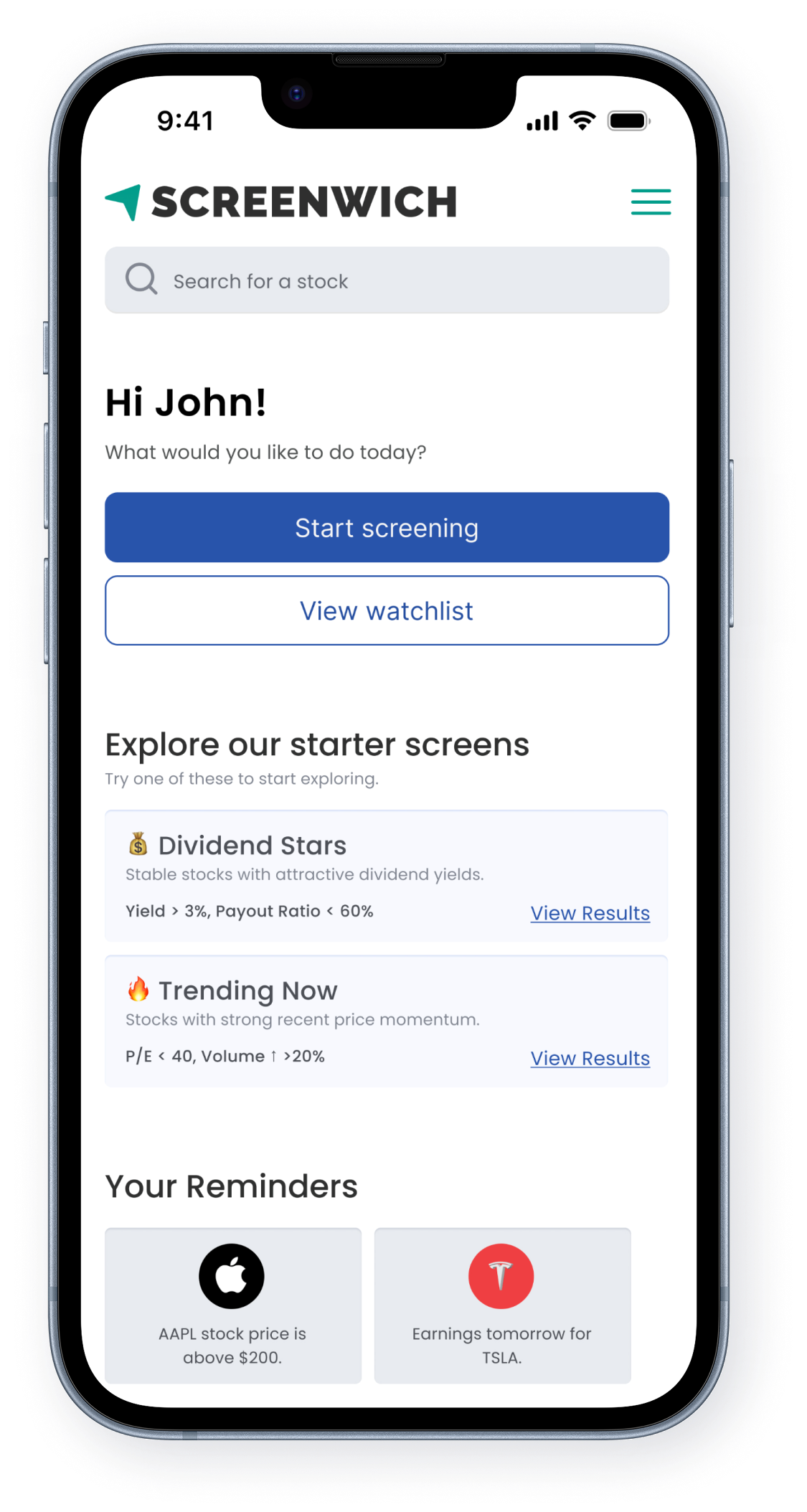
Task
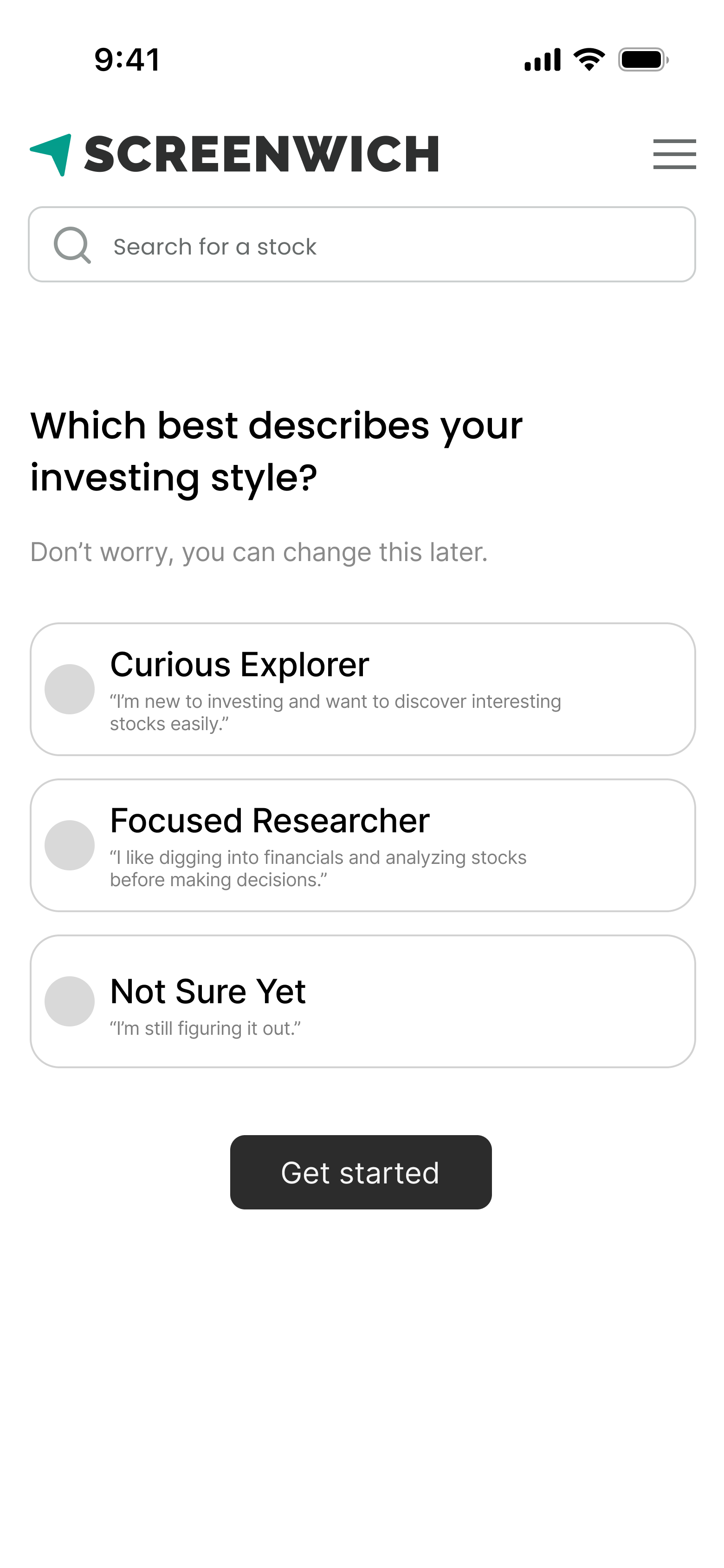
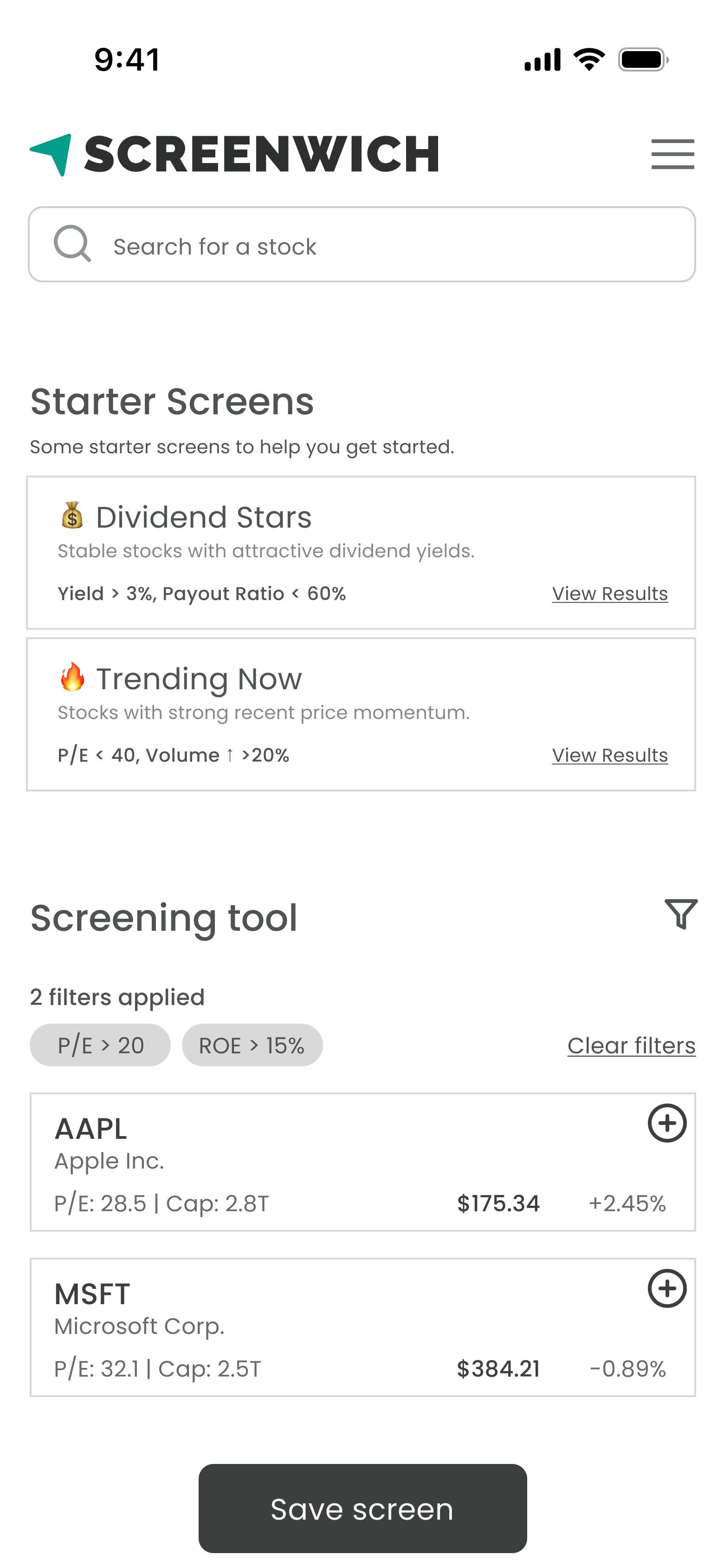
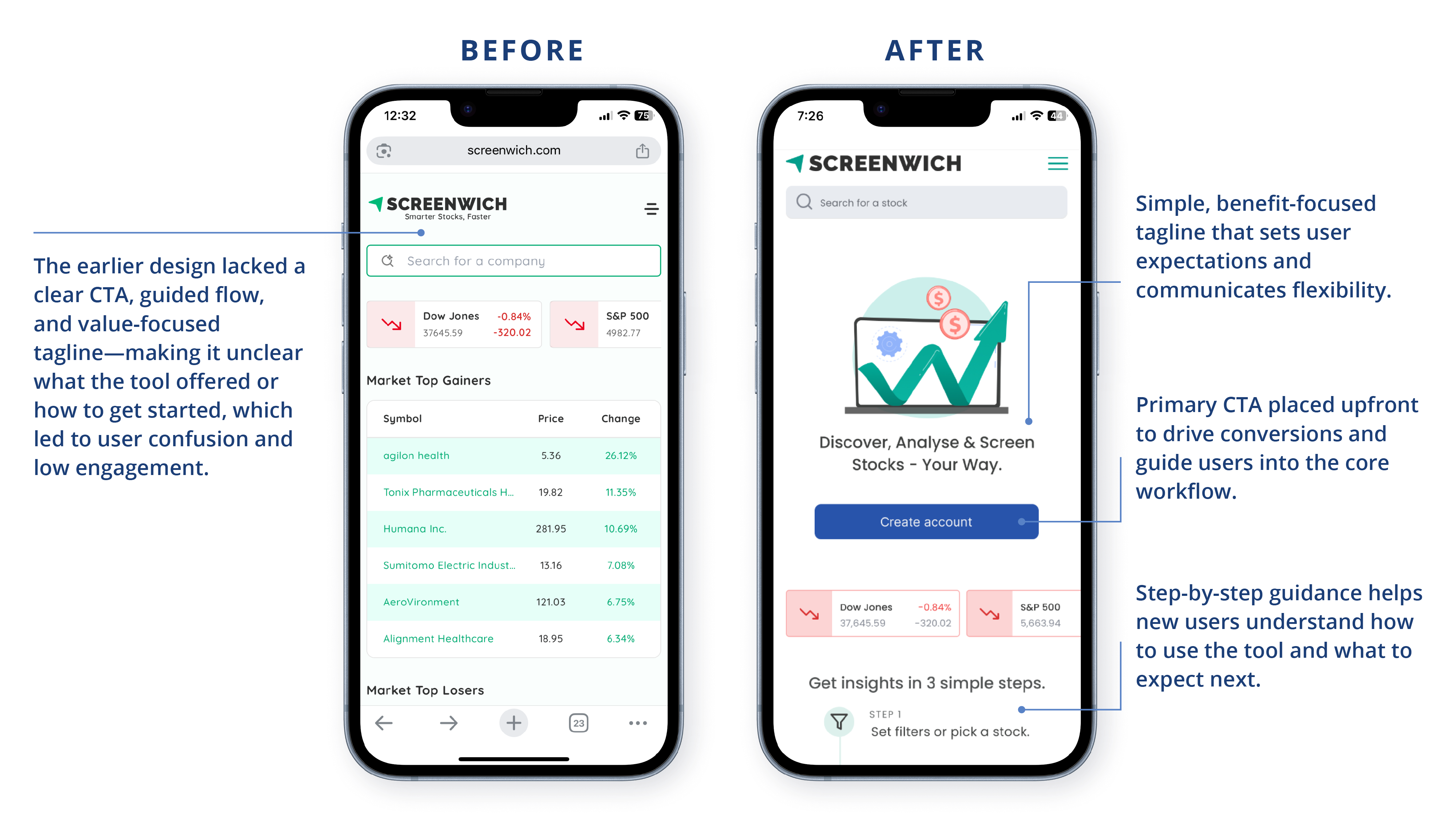
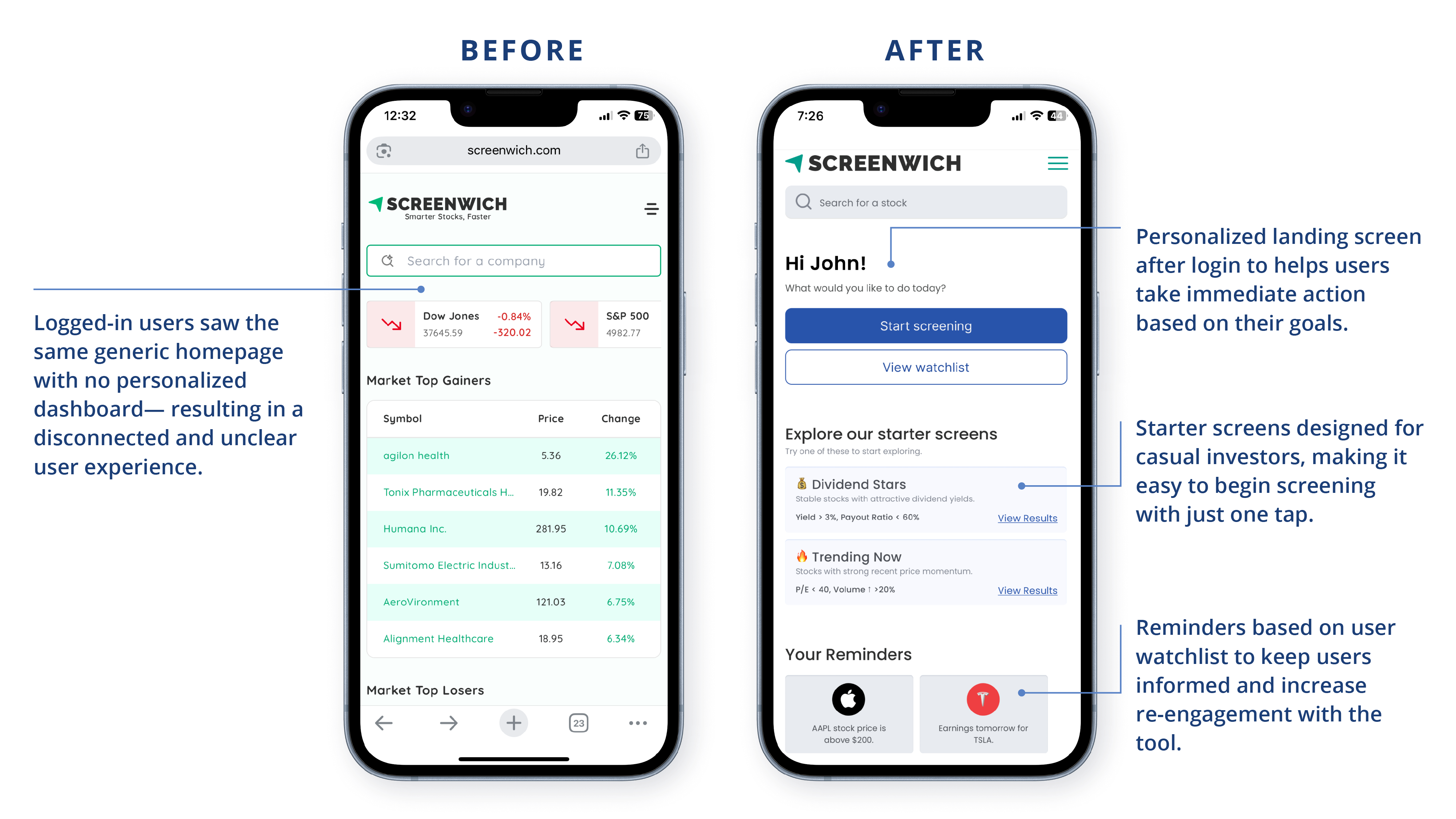
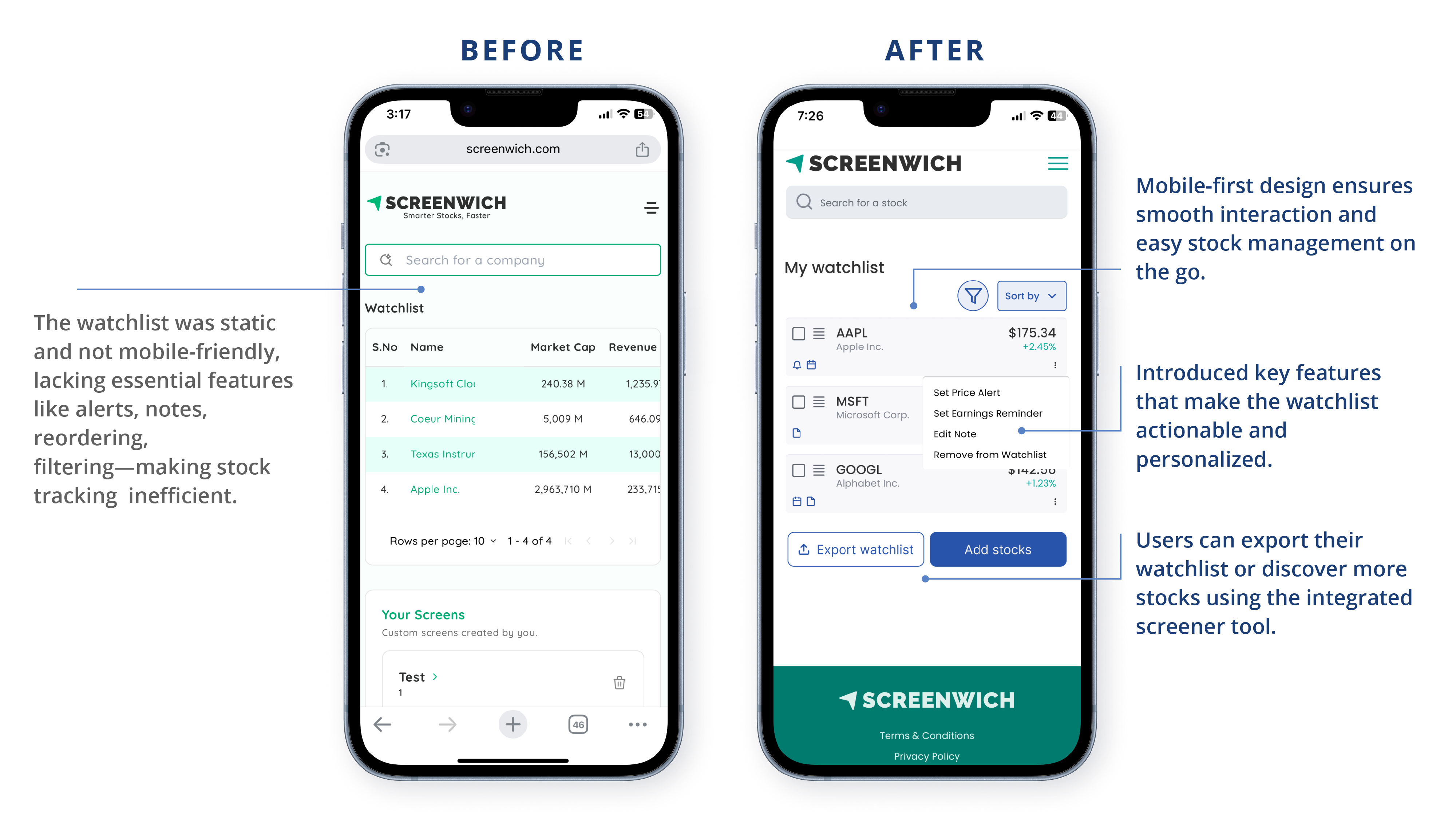
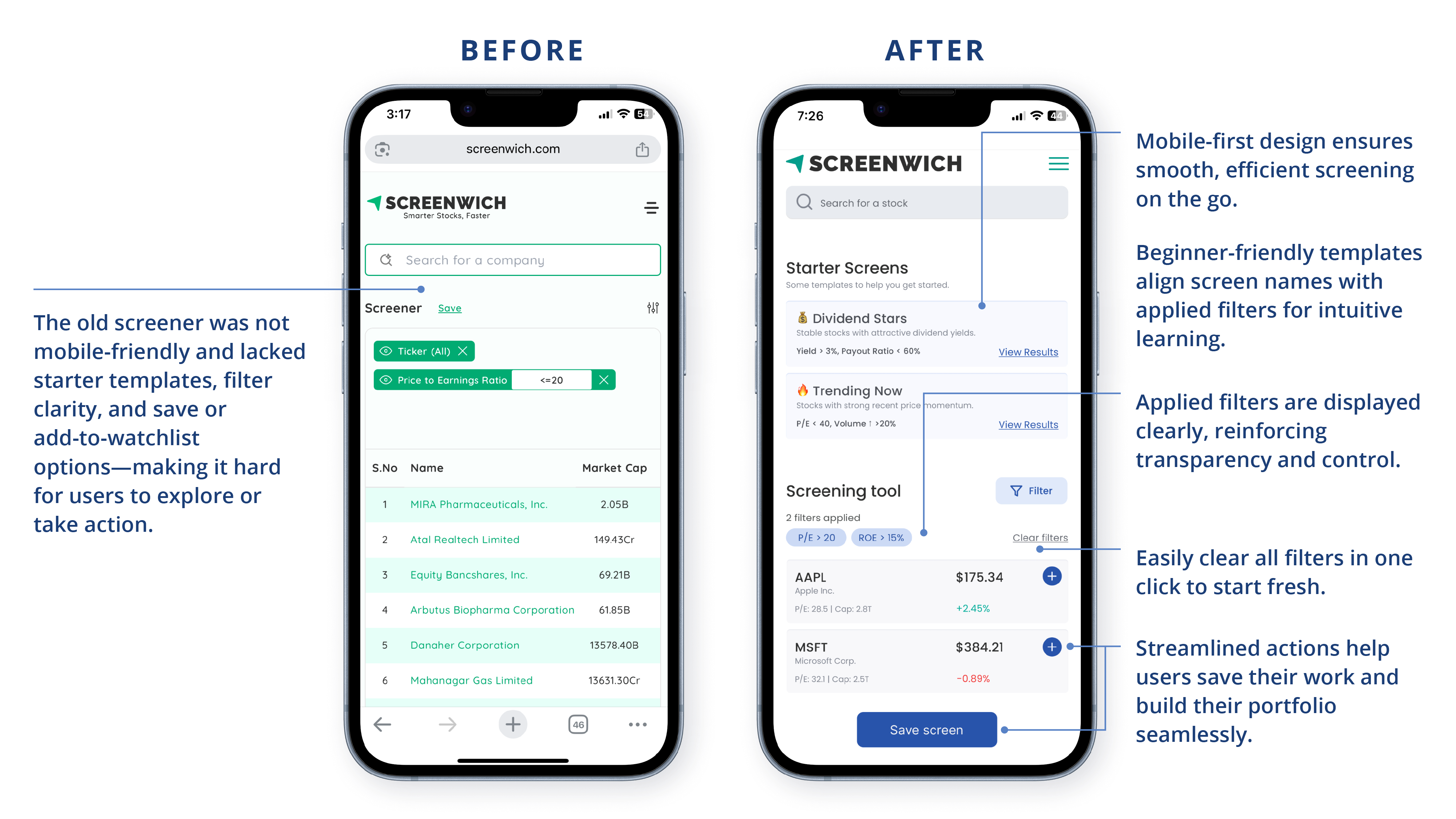
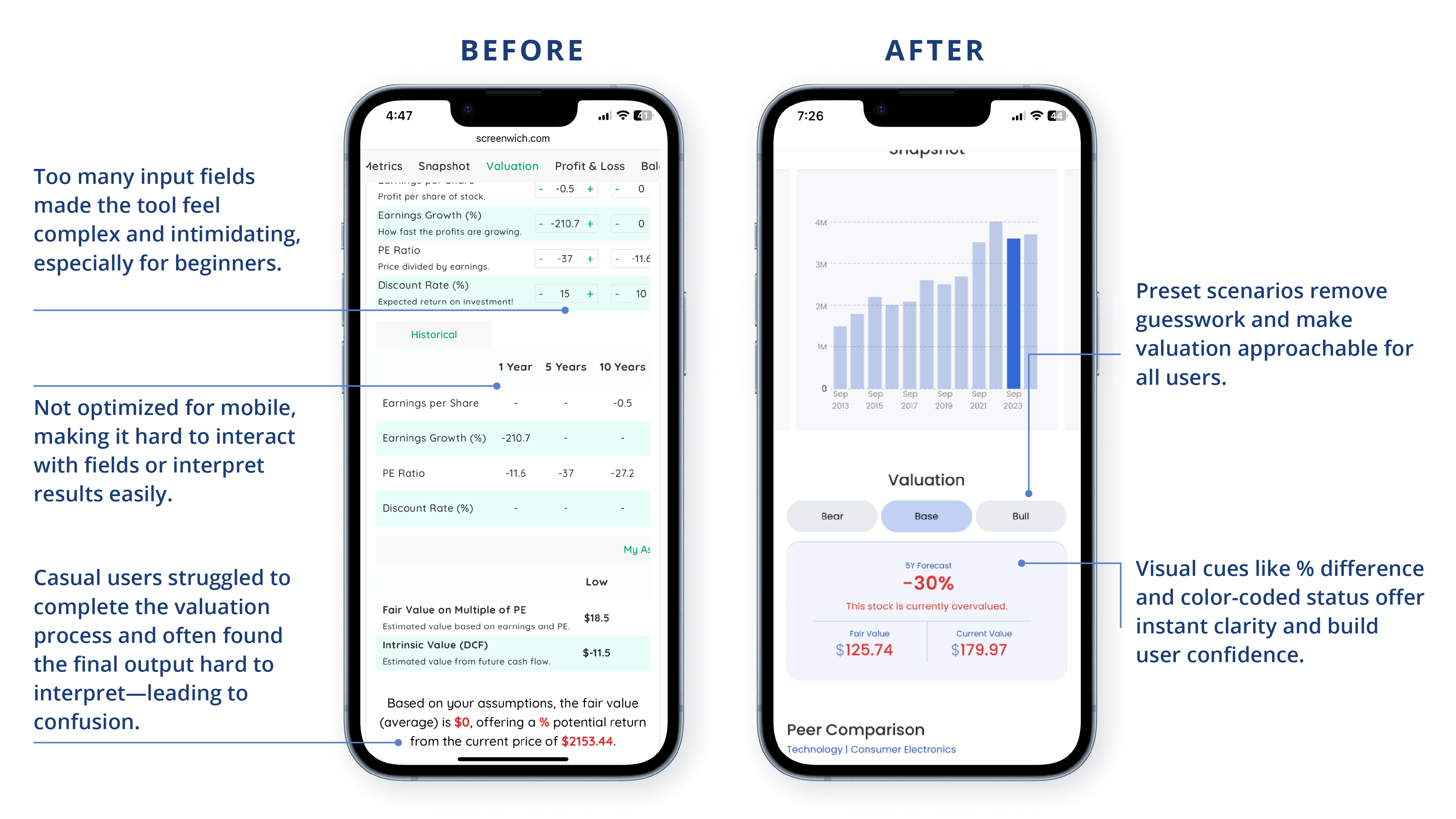
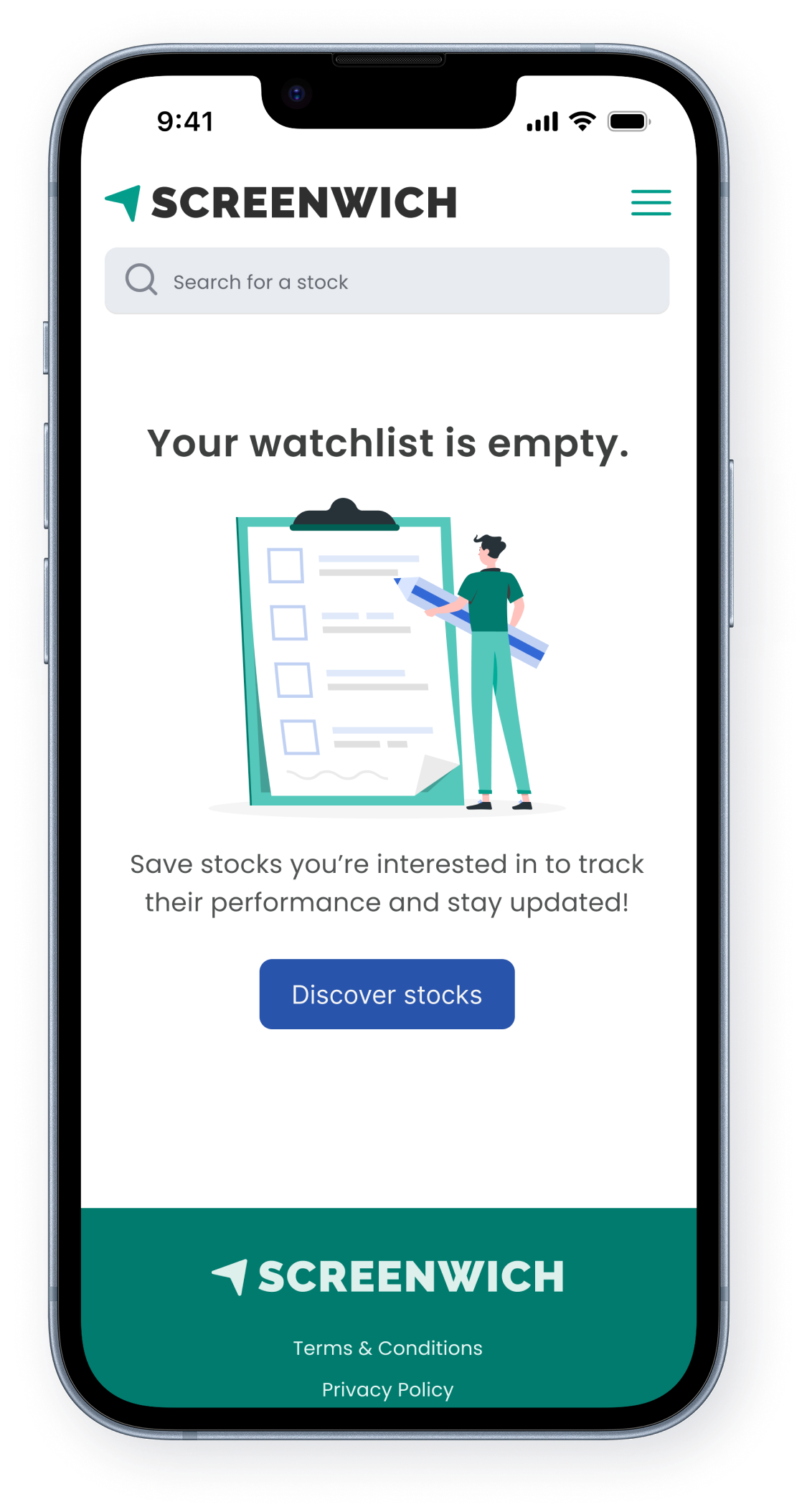
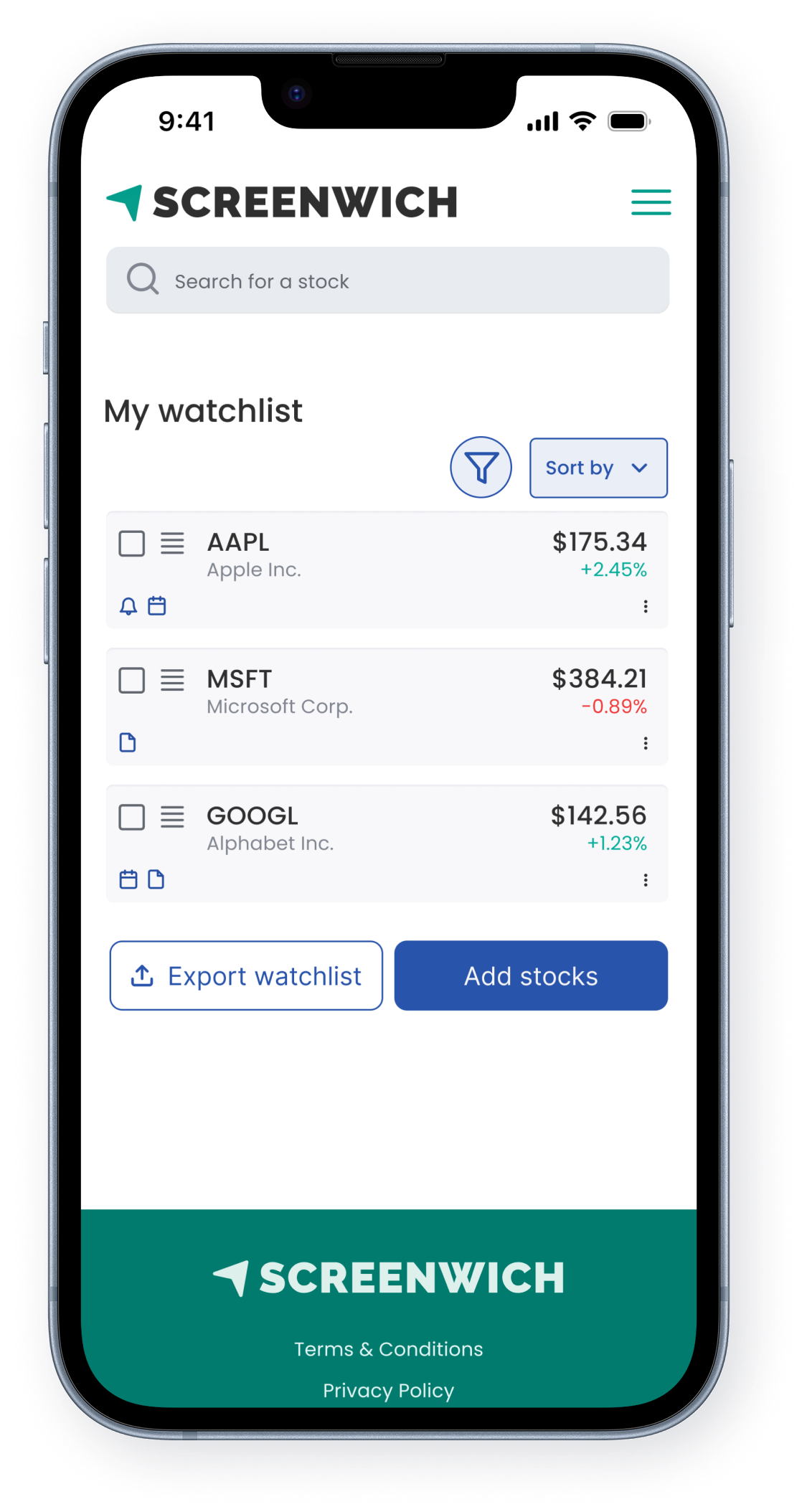
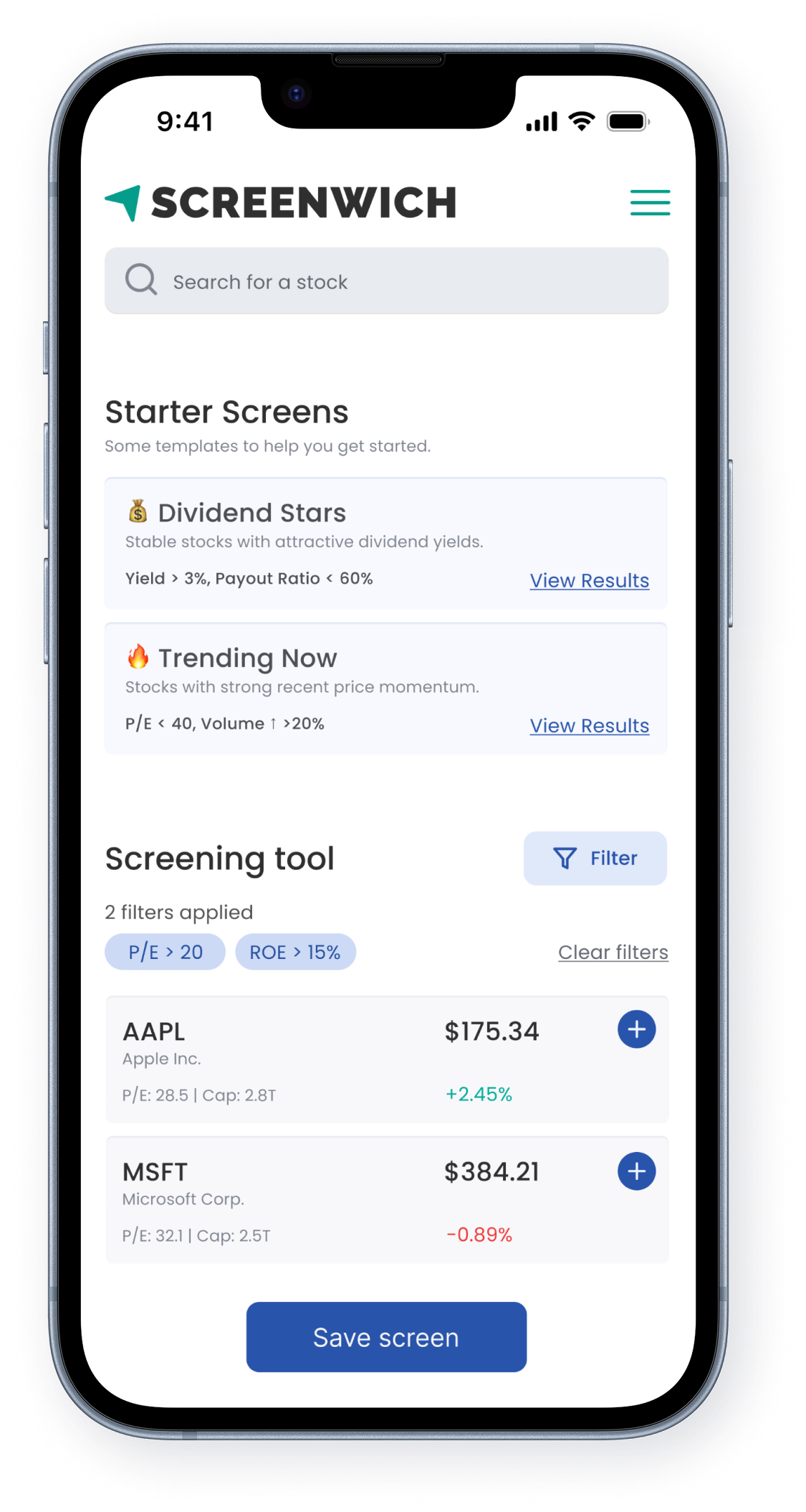
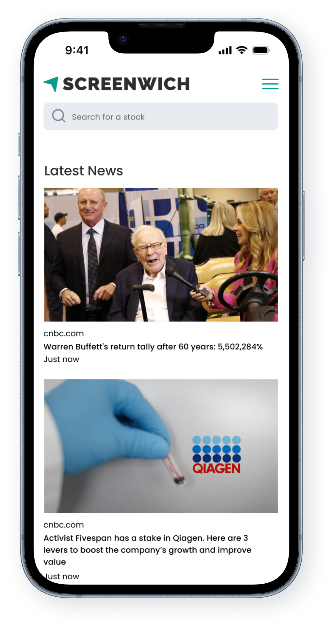
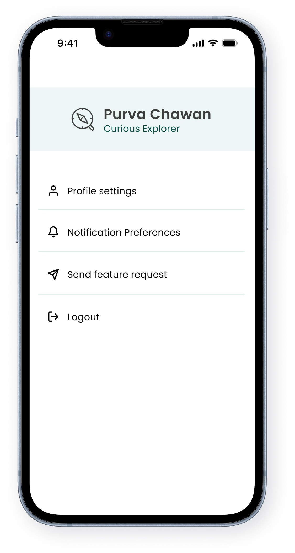
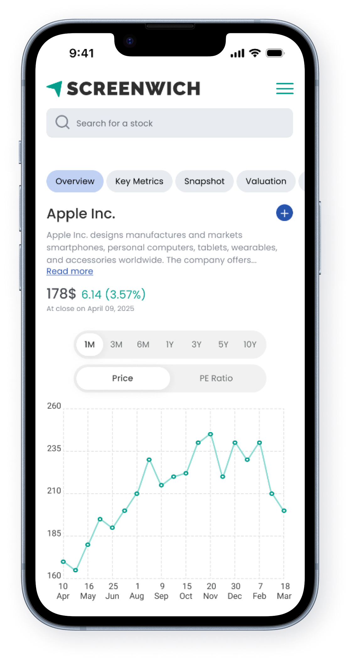
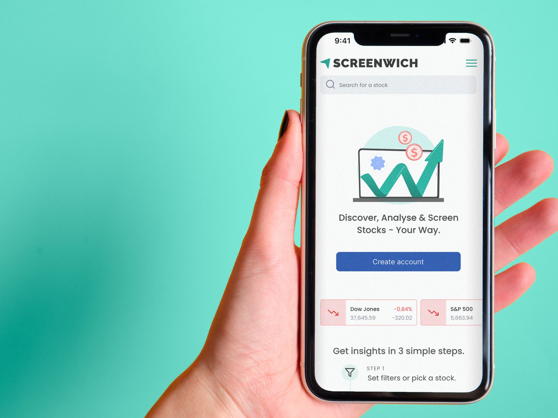
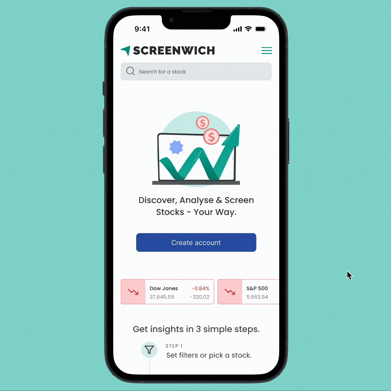
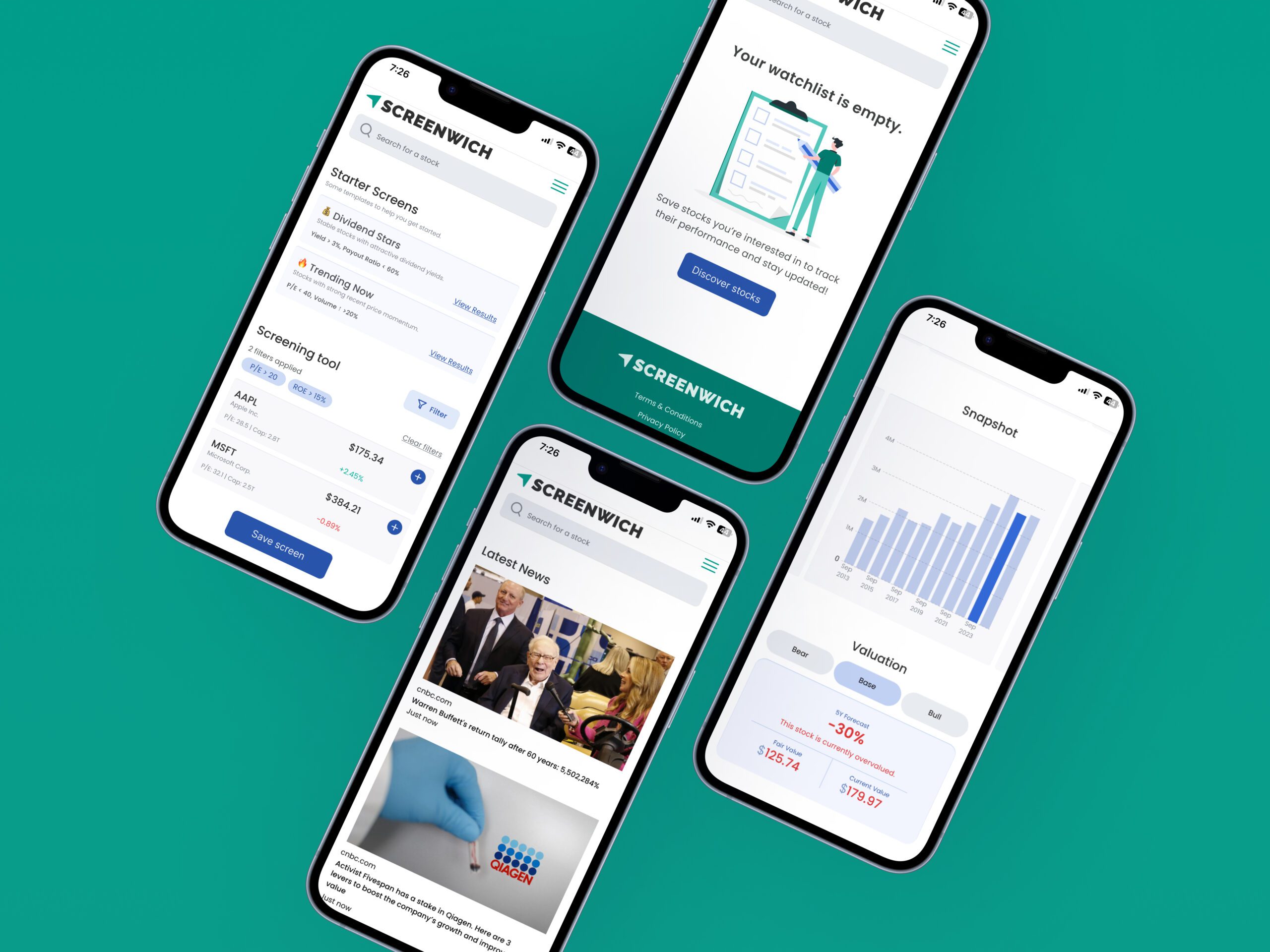
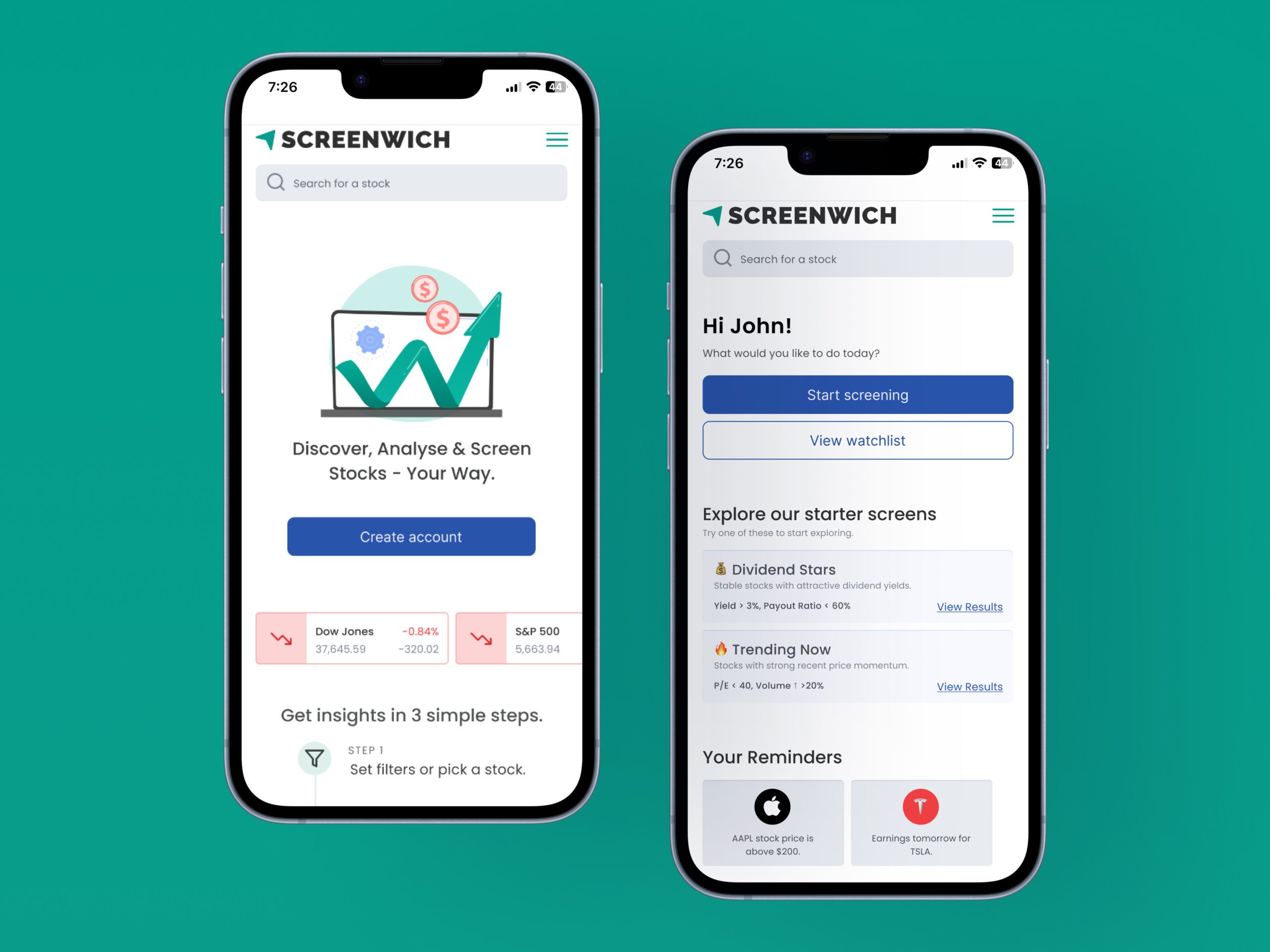
Redesign Screenwich to improve usability, simplify stock discovery and valuation, and boost engagement for both casual and experienced investors.
-
Role
Product Designer, UI Designer, UX Researcher
-
Team
6+ members
-
Tools
Figma, Miro, Abobe Illustrator, ChatGPT, UXPilot, Magic Patterns
Case Study
Screenwich is a stock screening and valuation tool built for both casual and analytical investors. While it aimed to simplify stock discovery and valuation, early users found it unintuitive and hard to use—leading to low engagement.
This redesign focused on making the experience more intuitive, personalized, and actionable to better support user needs and drive retention.
Problem
Screenwich suffered from low engagement and poor sign-up conversion due to an unintuitive interface. Users struggled with complex navigation, making core features (discovery, analysis, tracking) feel disconnected and limiting market value.
Goal
To improve user engagement, increase sign-ups, and position the product as a go-to platform for both casual and experienced investors.
Target Audience
Success Metrics
68%
45%
50%
Contents
Pain Points
Users found the platform overwhelming and difficult to navigate. The screener lacked clarity and guidance, the valuation tool required too many manual inputs, and the watchlist offered limited functionality. Casual users struggled to understand financial metrics, while experienced users were frustrated by the lack of customization and control—resulting in low engagement and high drop-off rates.
Research
To better understand user needs and validate assumptions, I conducted both primary and secondary research.
User interviews and testing revealed confusion across key tools and a reliance on social media for guidance. Analytics showed early drop-offs and low conversions.
On the secondary side, I explored Reddit forums to understand real user behaviours and analyzed competitors like Screener.in and TradingView to identify common patterns and UX gaps.
Research Findings
68%
42%
63%
18%
71%
61%
Key Takeaways
- Make it easier to find trending stocks for social investors.
- Make watchlist more actionable using earning reminders and price alerts.
- Make screening tool easy to use.
- Make valuation experience low effort.
Using AI For Design
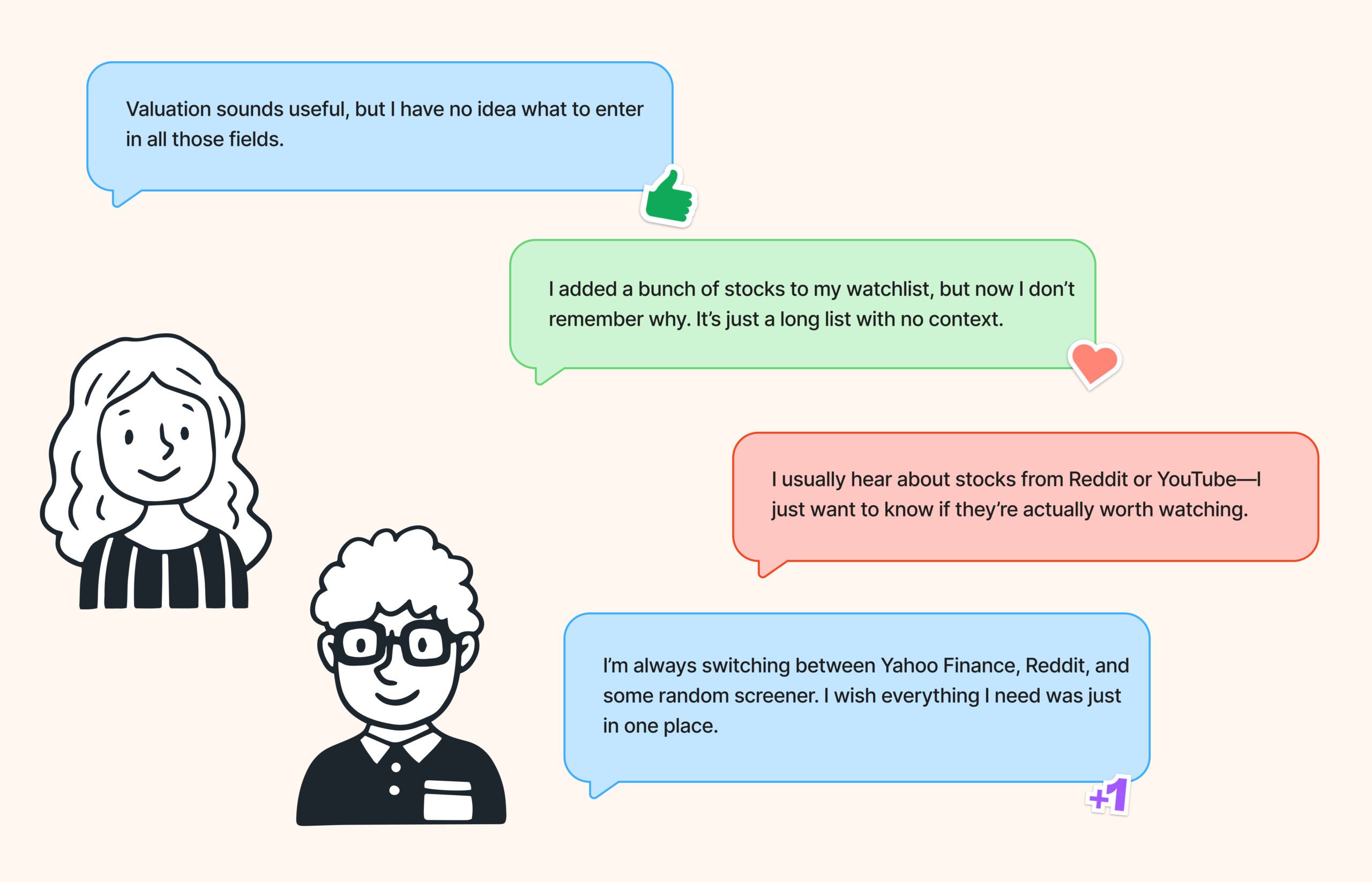
I used AI tools to accelerate my workflow and spark early design direction. After gathering requirements, I explored initial ideas using ChatGPT, UXPilot, and Magic Patterns to test design patterns across different areas of the product. I then synthesized those insights to create custom wireframes based on the most effective solutions.
Updated User Flow

Site Map

Wireframes
I used UXPilot and MagicPatterns for idea generation, then combined those insights with my own wireframes to apply the best UX patterns for each screen.


From Friction to Flow
The original experience had usability gaps across key touchpoints—from overwhelming input fields to a lack of guidance and mobile optimization. Through thoughtful redesign, I transformed these friction points into a smooth, intuitive journey that supports both casual and advanced investors.
1. Generic Home Page → Clear Call-to-Action for Onboarding
2. Static Landing View → Personalized Starter Dashboard
3. Basic Watchlist Table → Actionable, Mobile-Optimized Watchlist
4. Dense Layout → Intuitive Screener with Starter Templates
5. Input-Heavy Valuation Form → Simplified, Insightful Valuation Tool
68%
45%
50%
What I Learned
I learned how to simplify complex experiences by guiding users instead of assuming prior knowledge. Using AI tools for quick ideation helped me explore patterns faster, while user needs ultimately shaped my design decisions. This project reinforced the importance of clarity, confidence, and context in product design.
Future Scope
Next steps could include adding portfolio tracking, AI-driven stock suggestions, and deeper personalization—such as surfacing filters or screens based on a user’s watchlist habits or investment style. Expanding to native mobile apps would further improve accessibility and engagement across investor types. Additionally, the valuation tool could evolve from simple presets to allow guided user inputs using contextual suggestions (e.g., average or historical P/E values), helping both casual and advanced users make informed assumptions with confidence.
High Fidelity Screens


